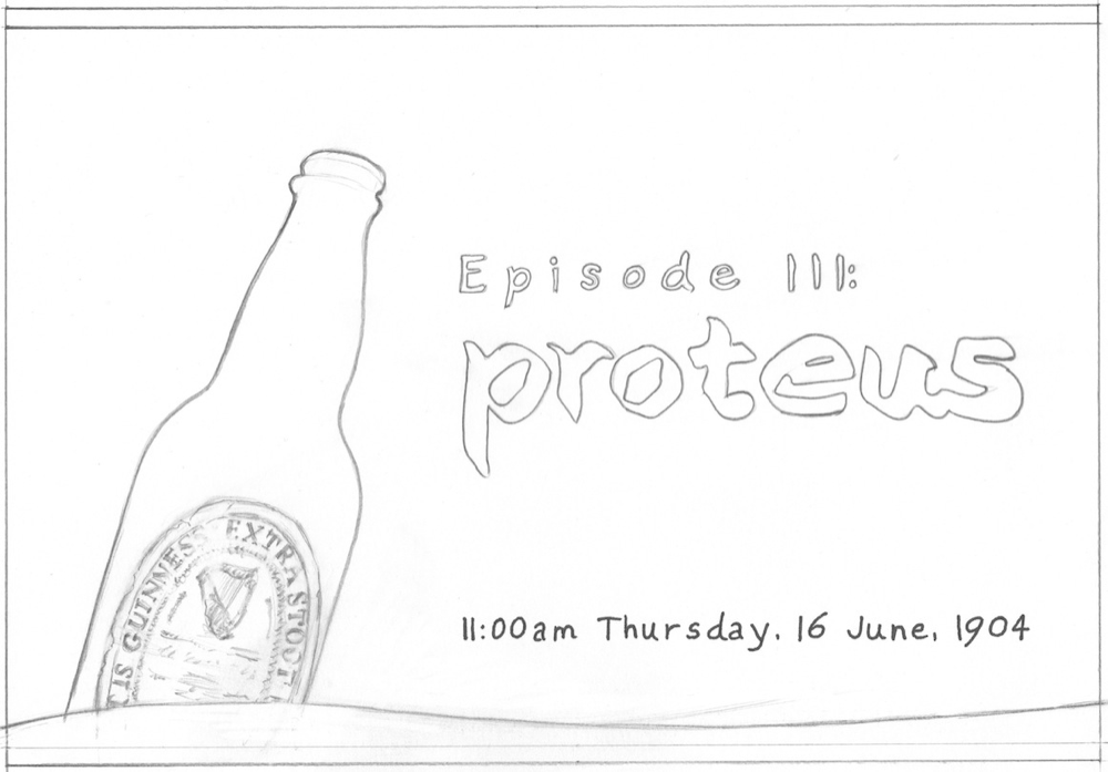
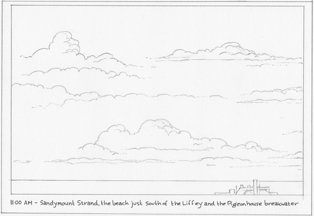
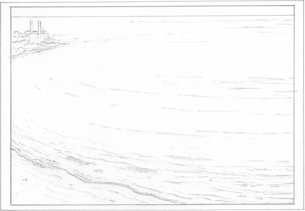
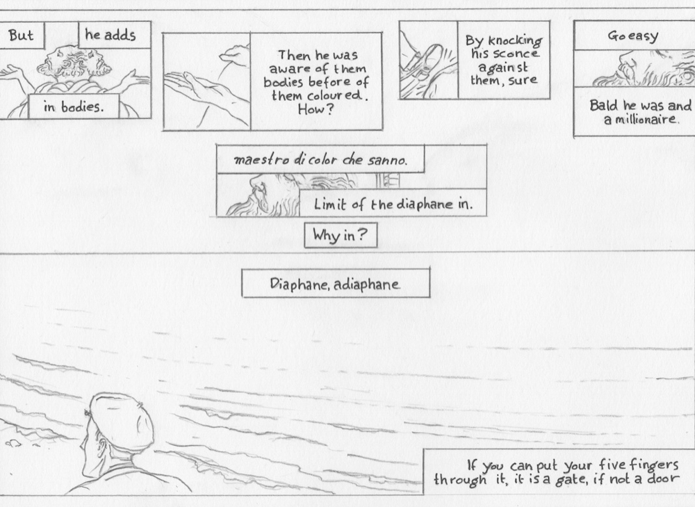
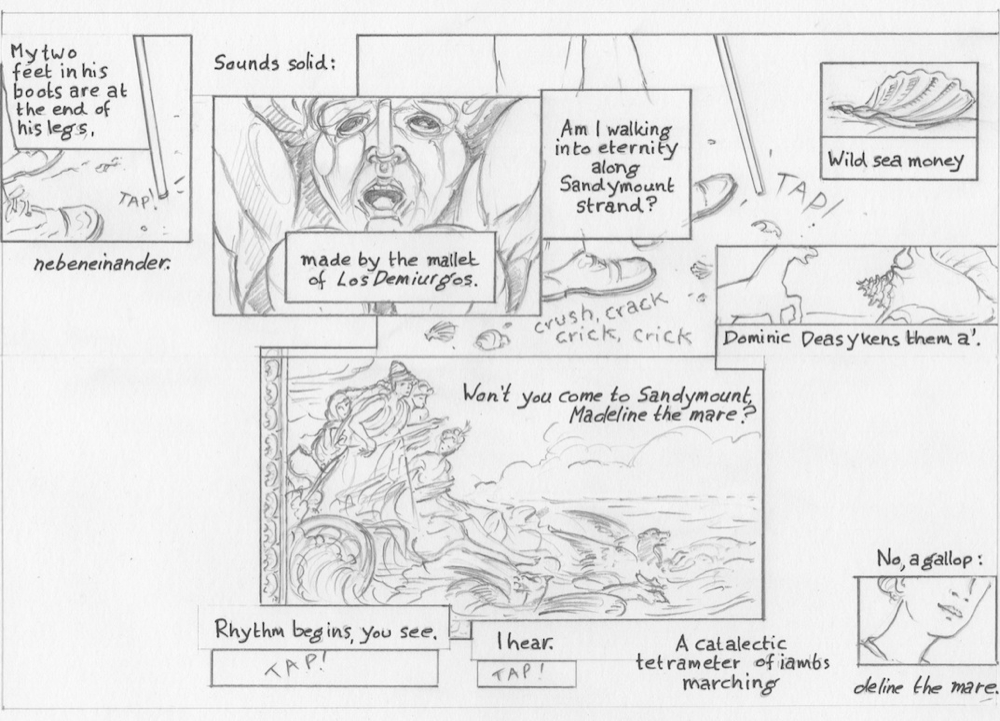
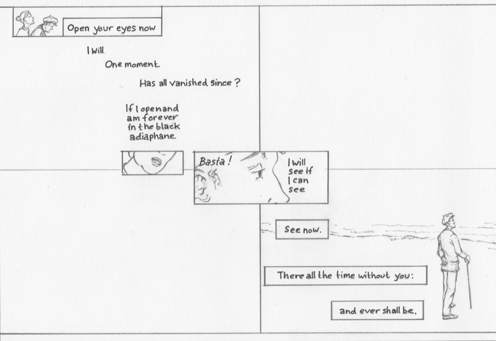
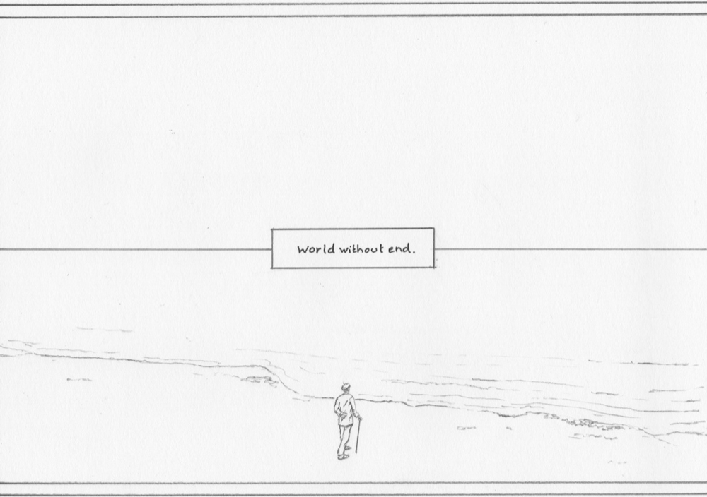
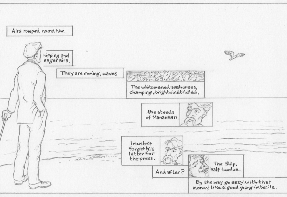
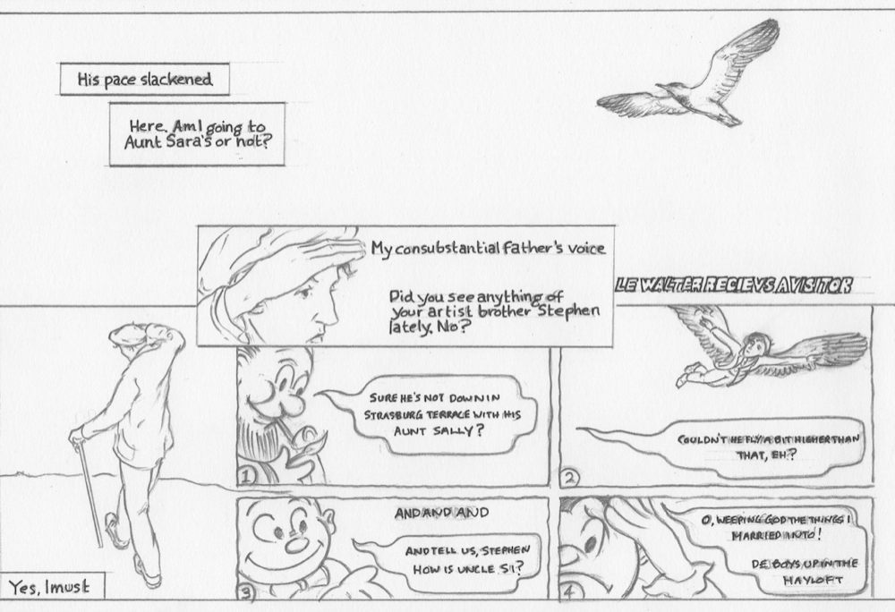
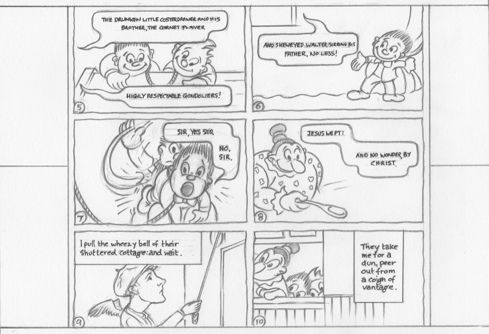
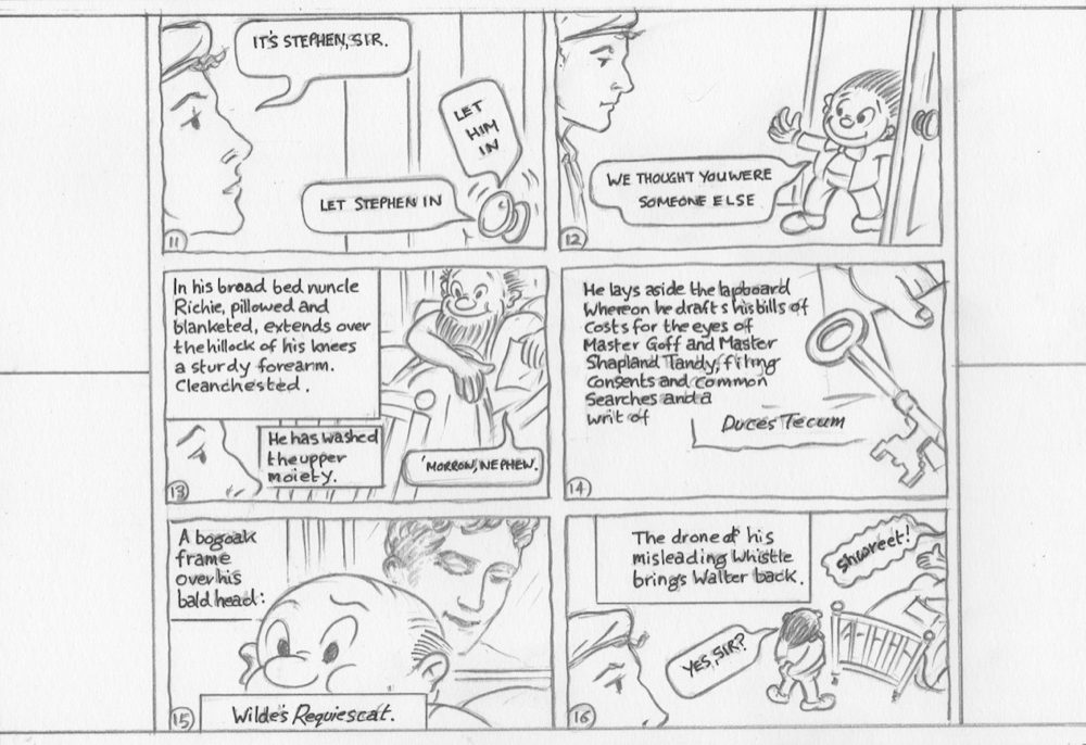
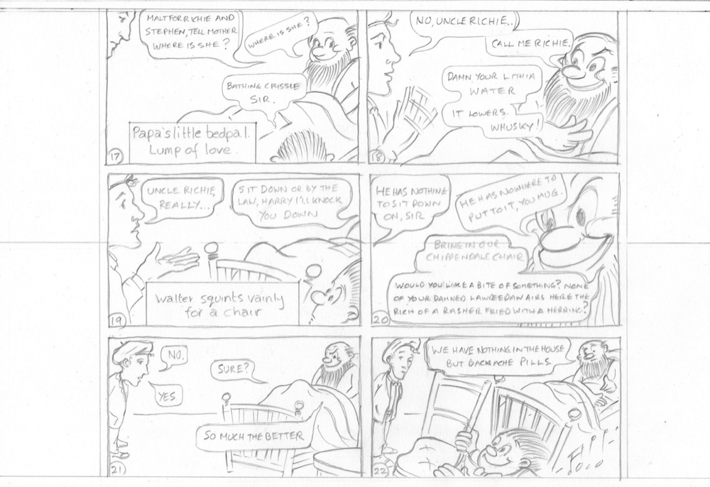
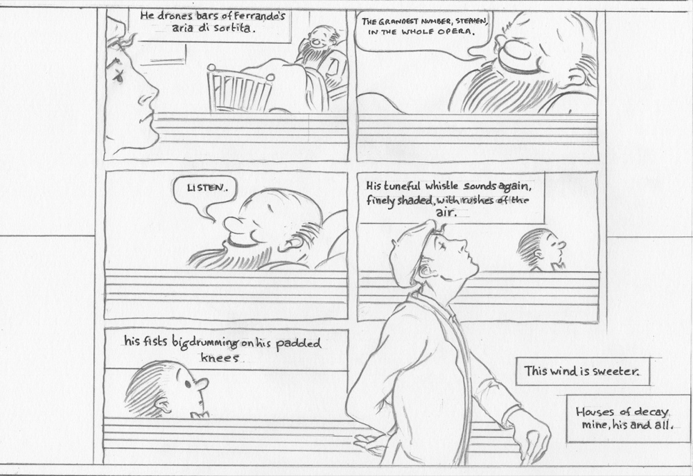
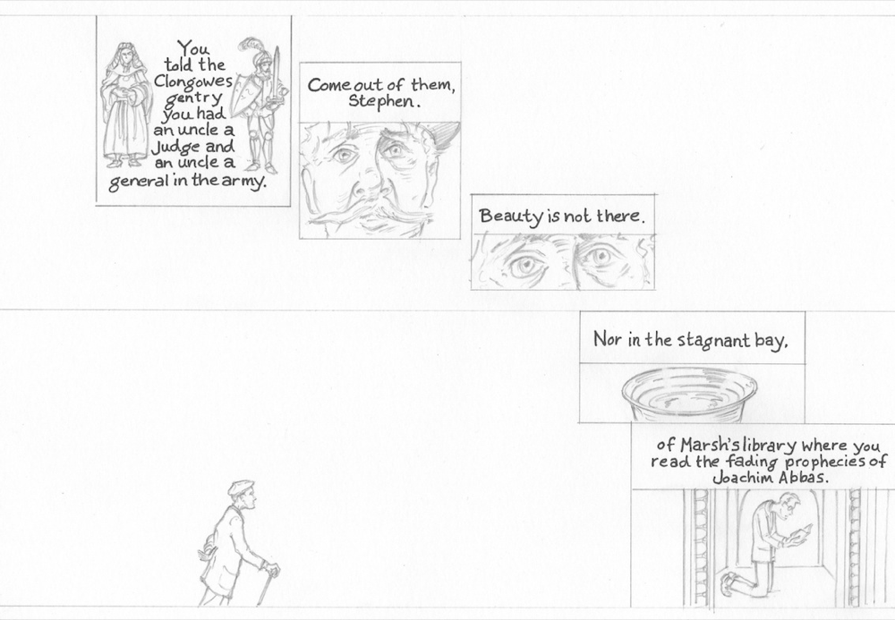
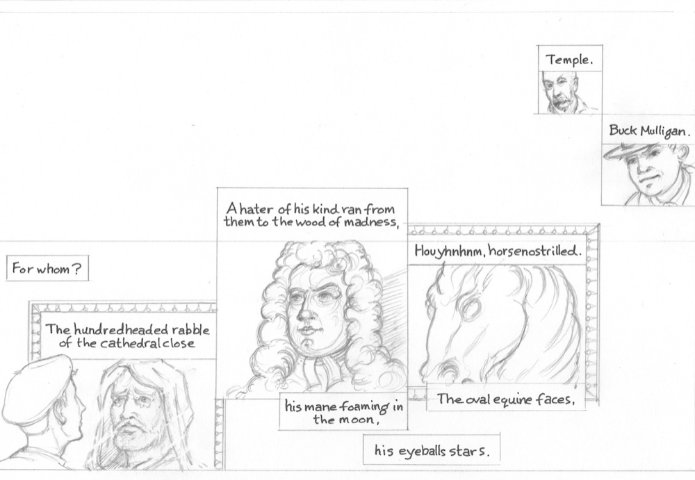
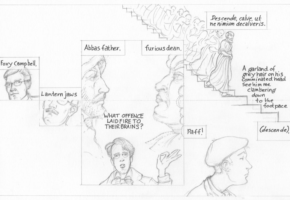
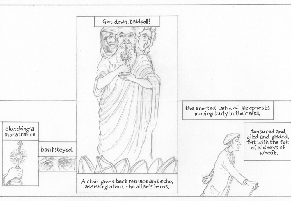
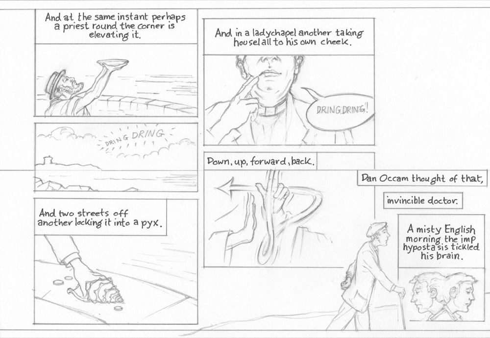
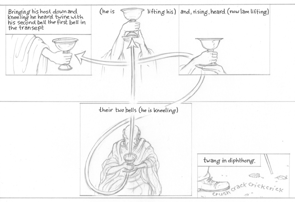
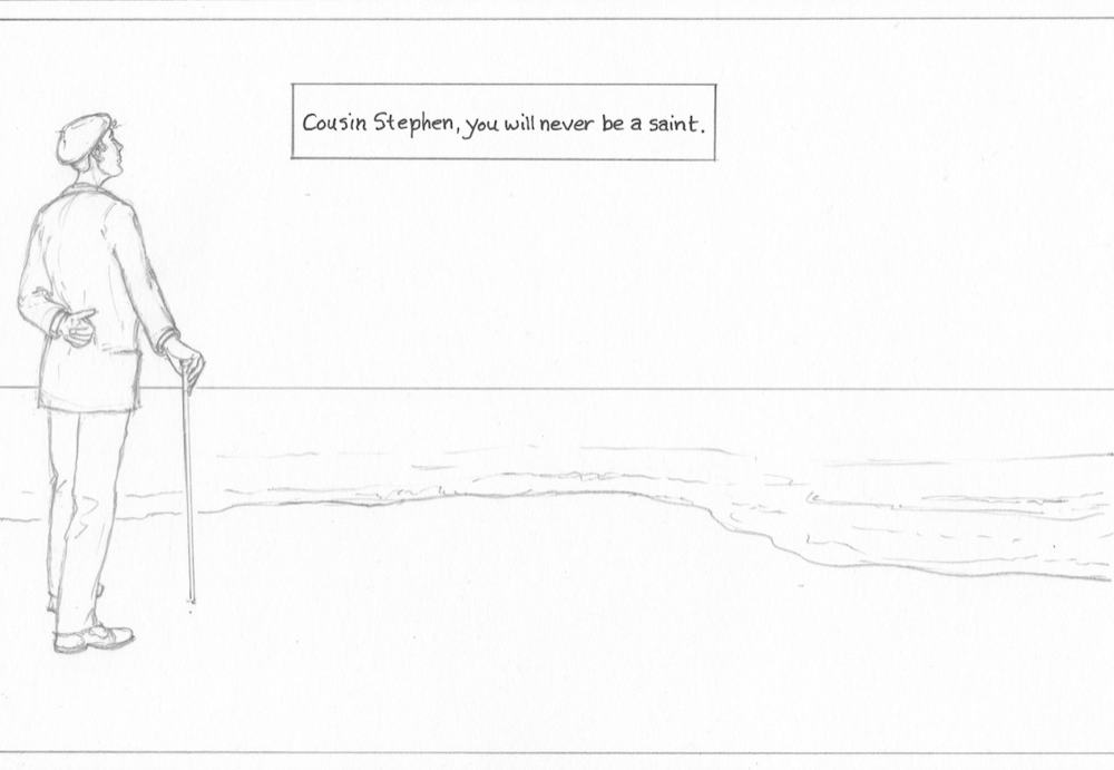
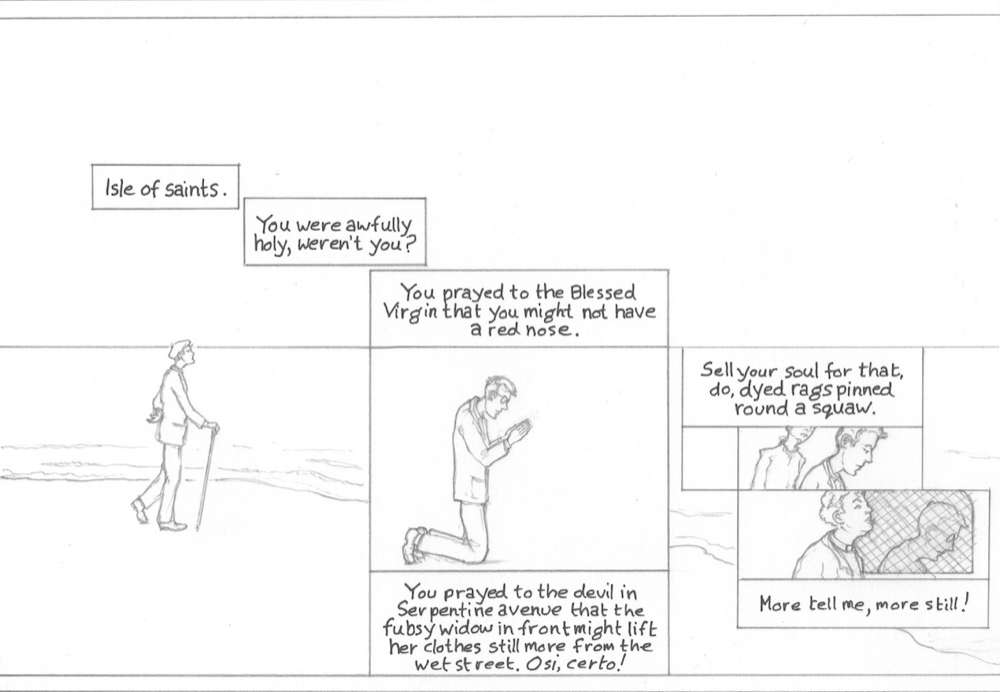
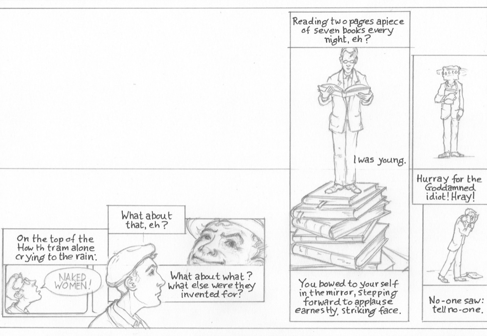
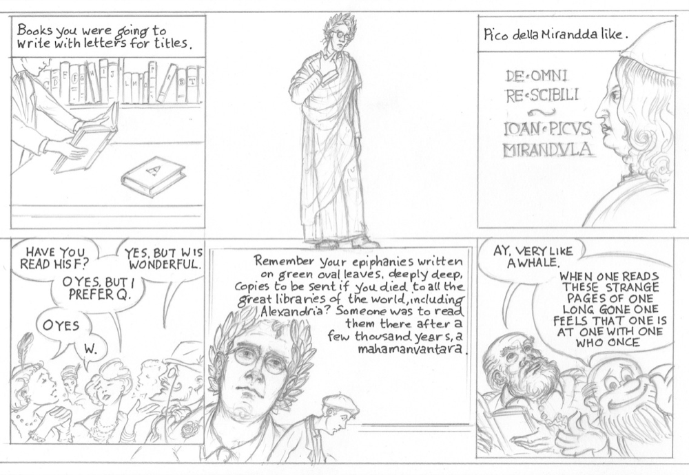
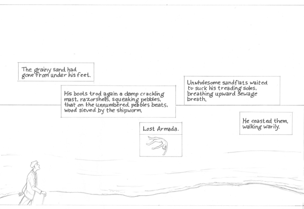
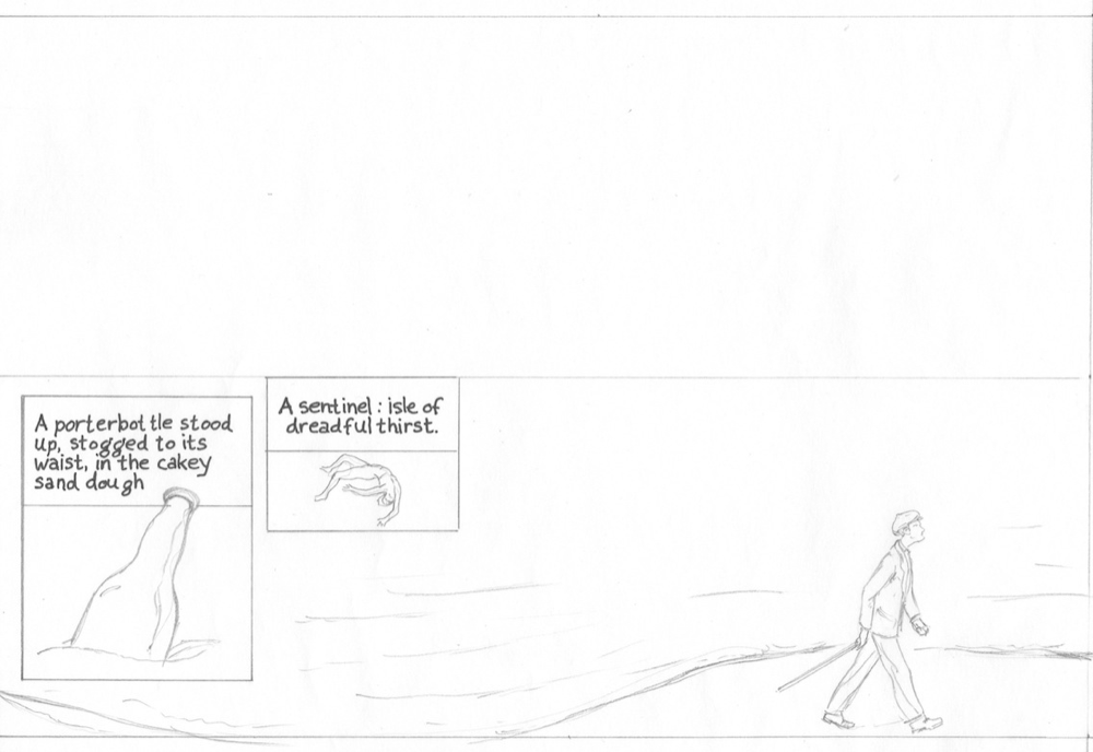
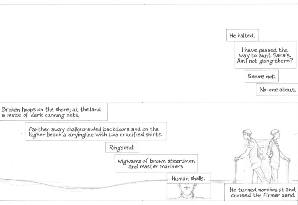
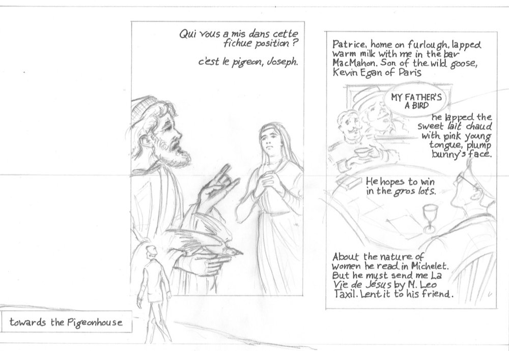
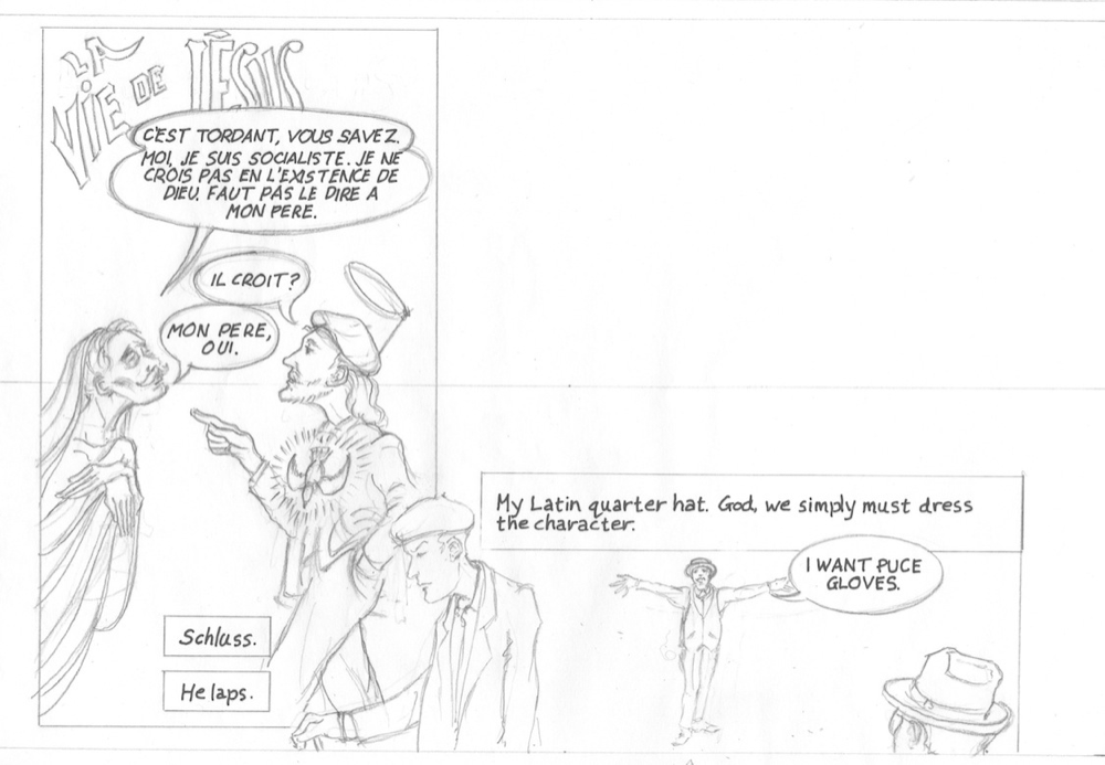
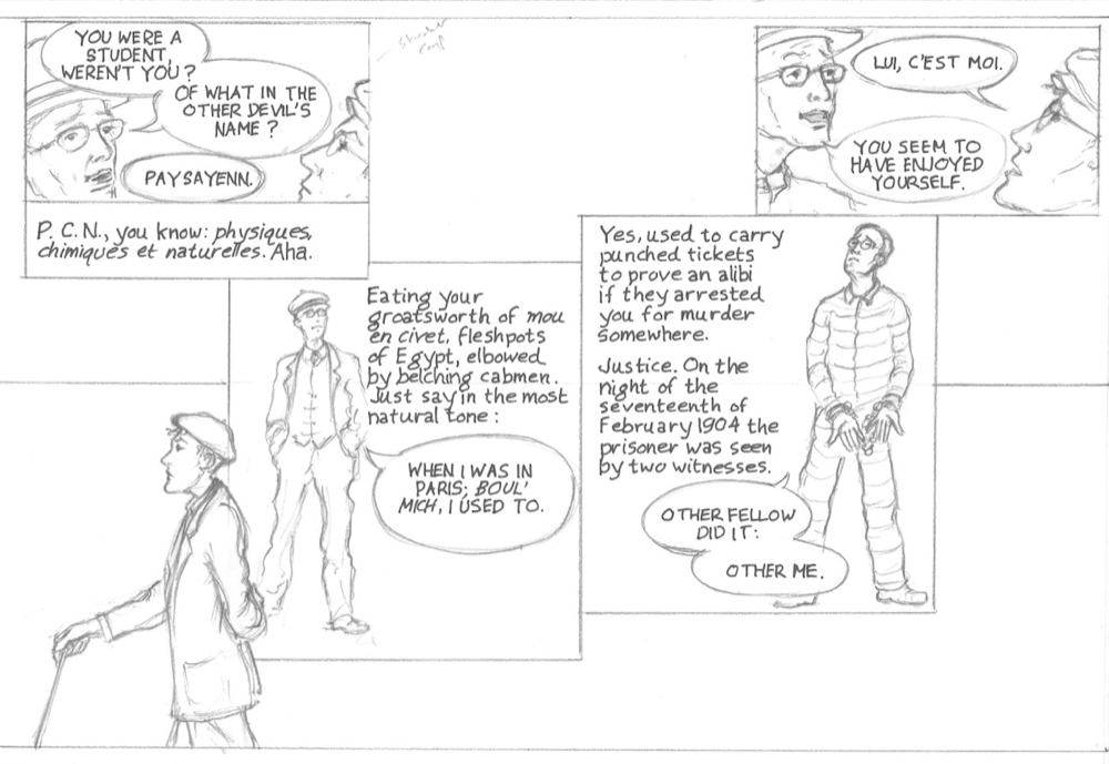
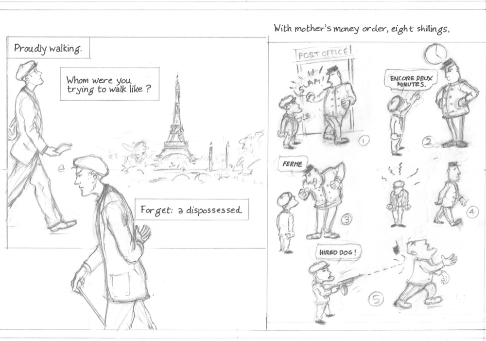
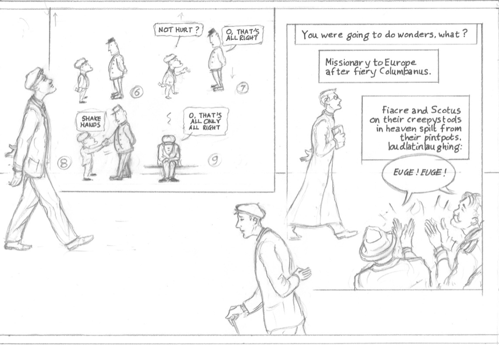
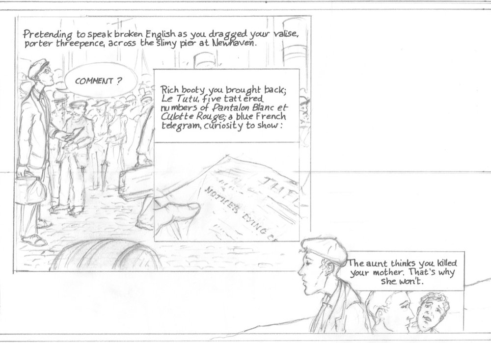
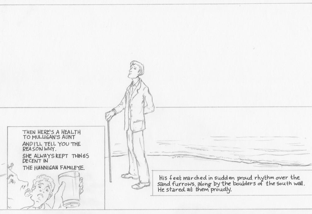
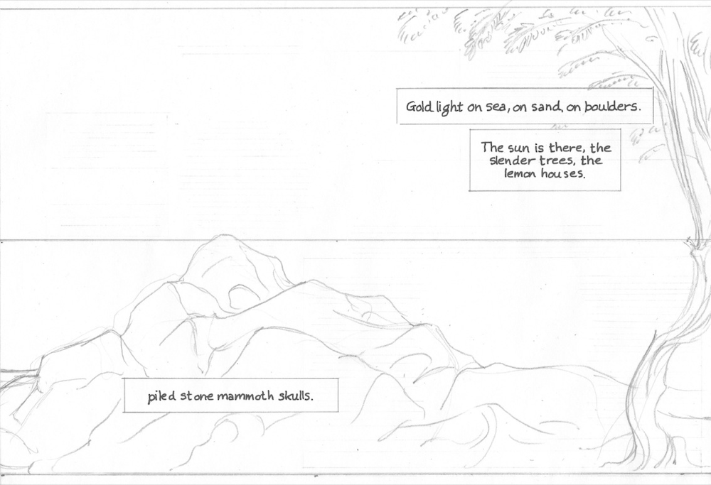
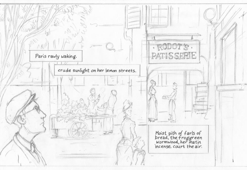
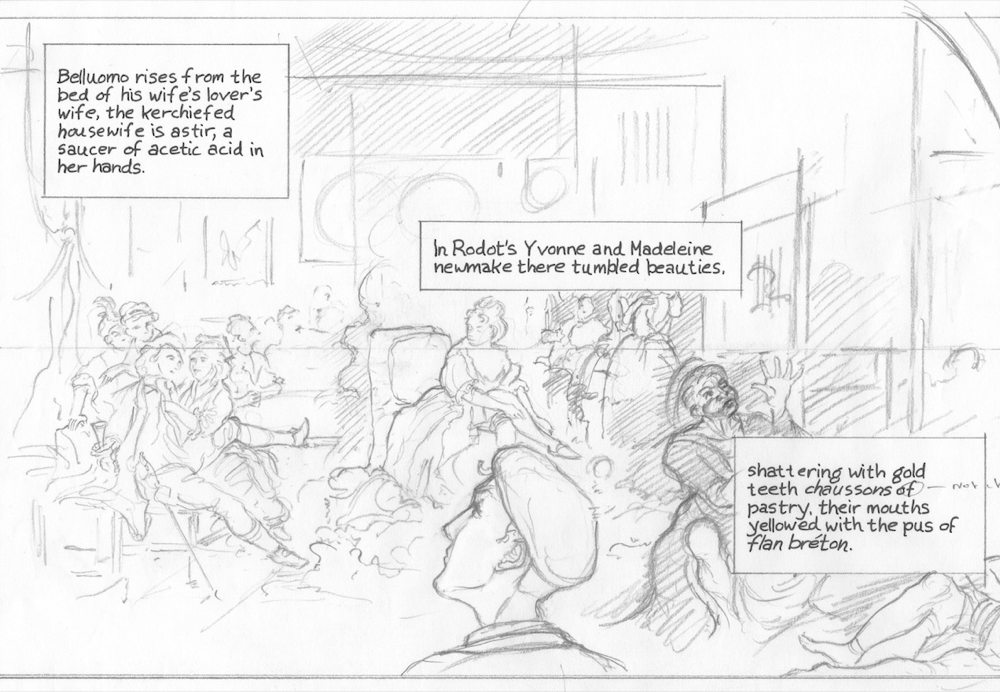
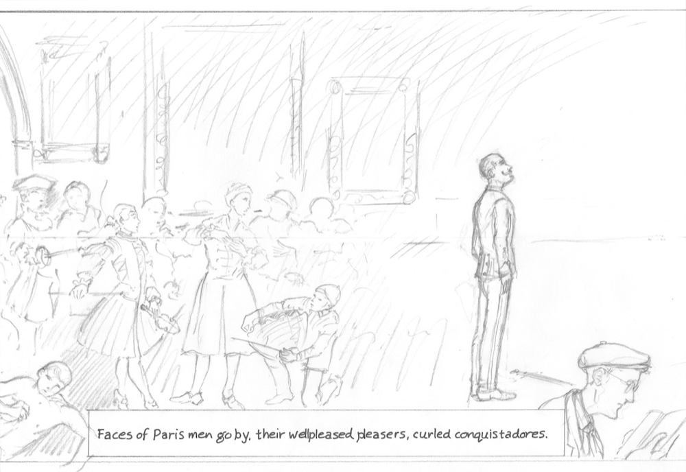
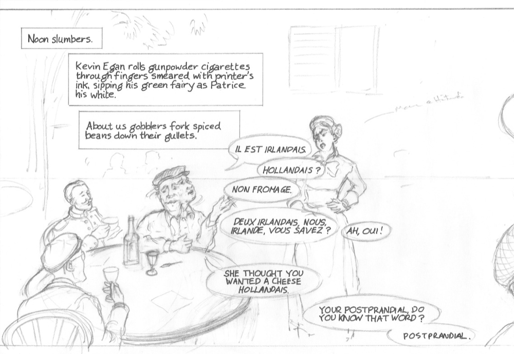
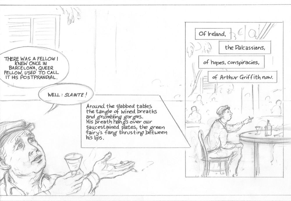
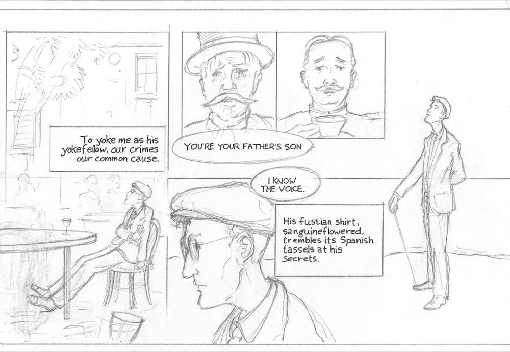
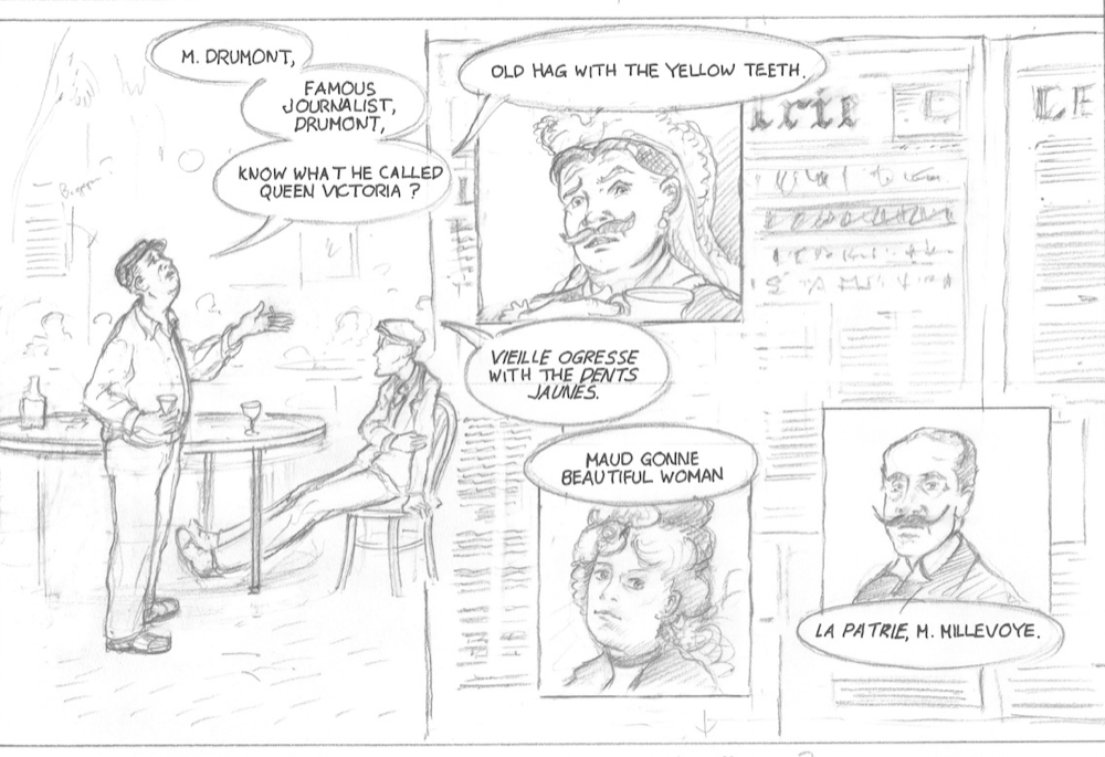
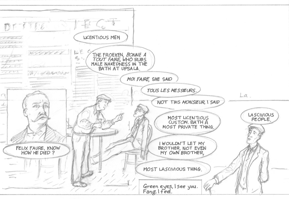
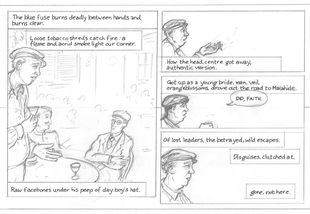
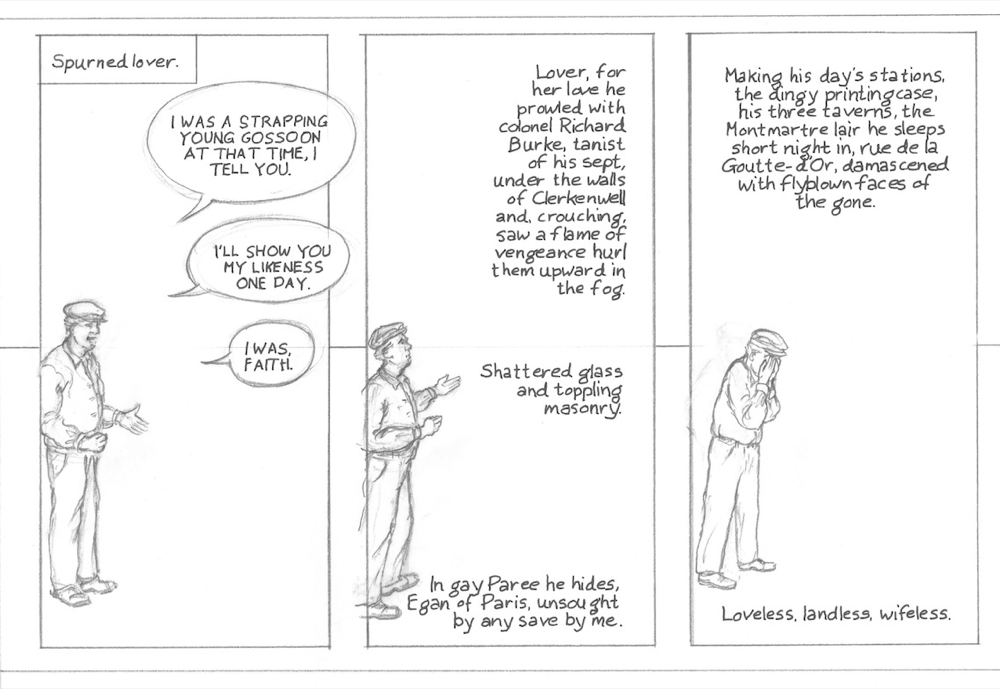
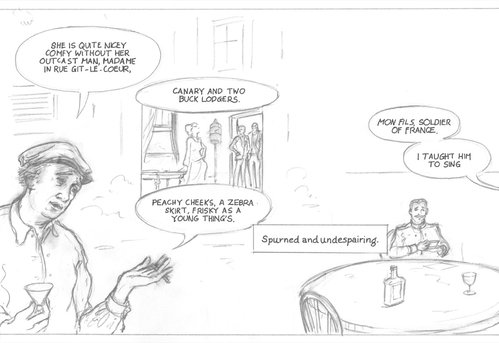
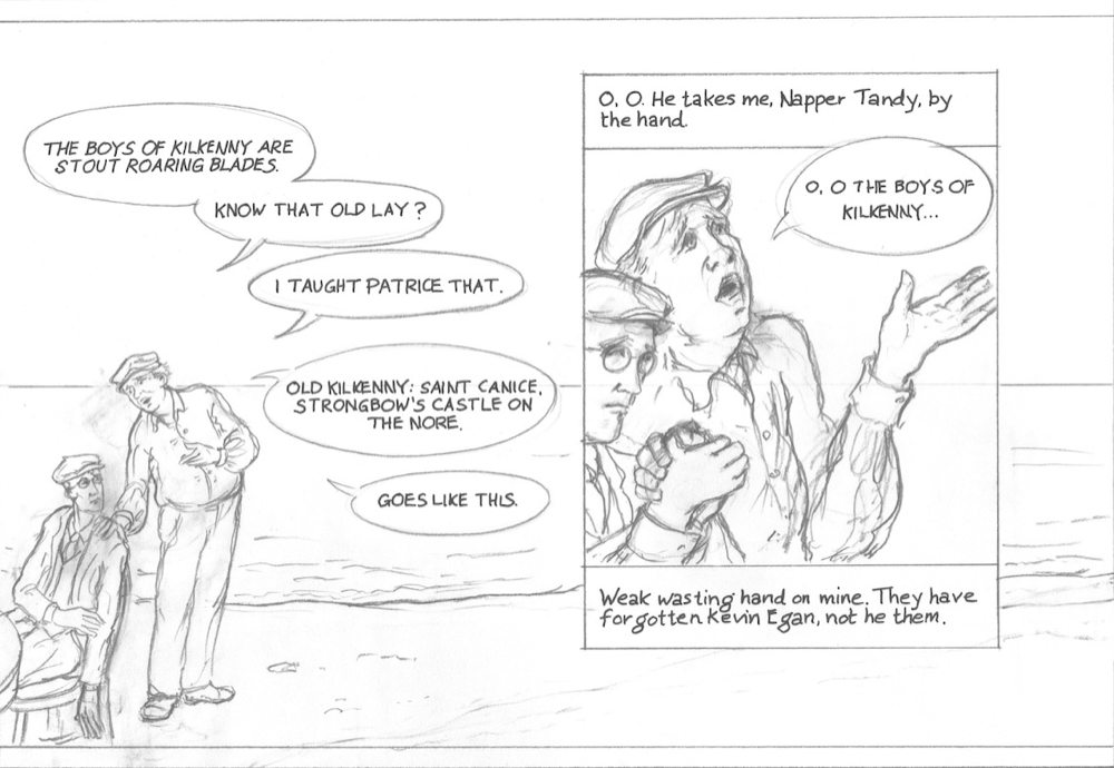
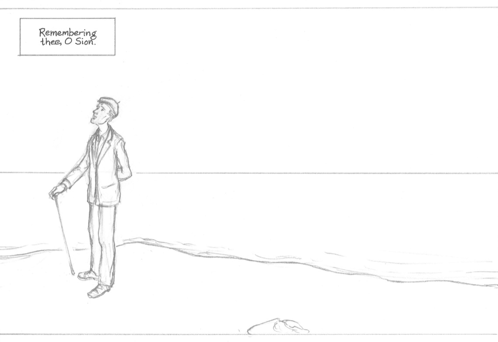
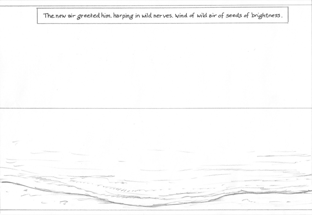
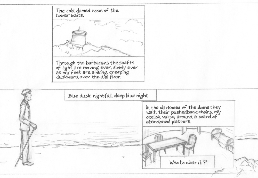
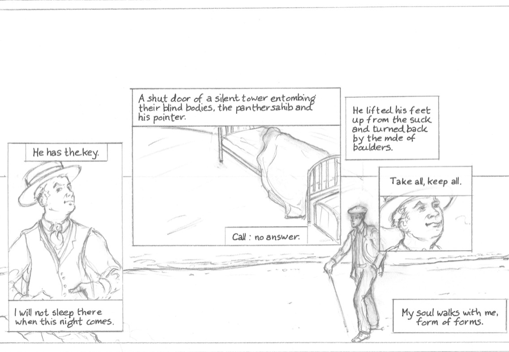
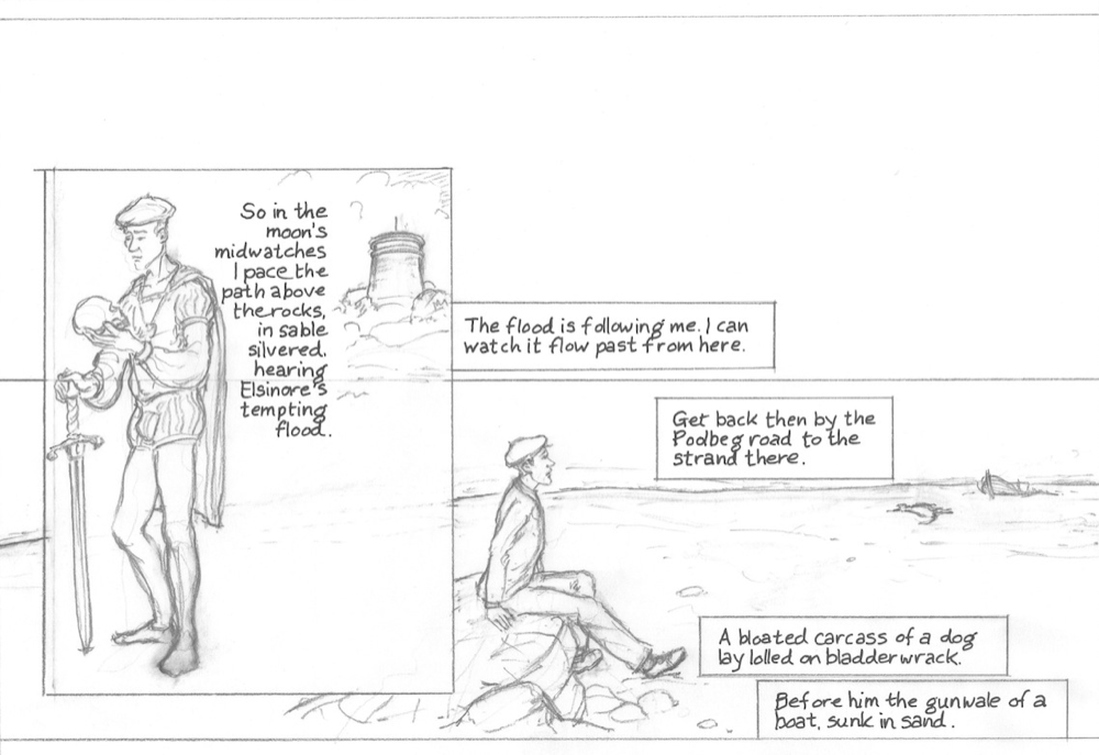
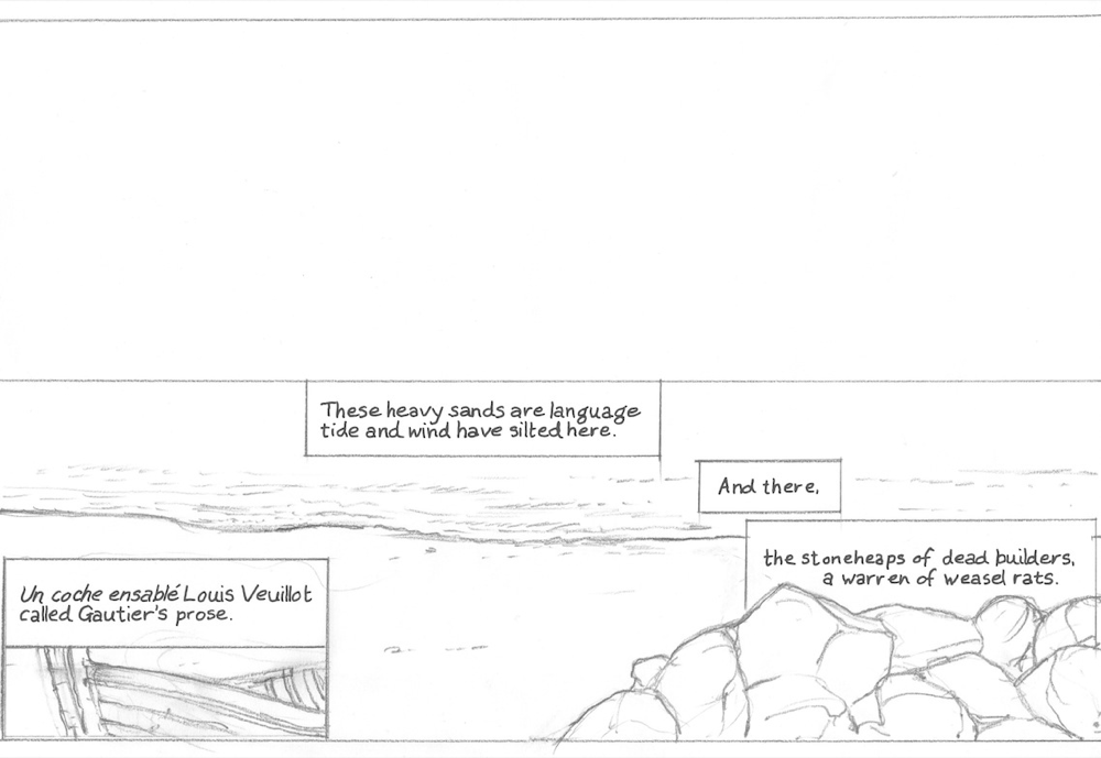
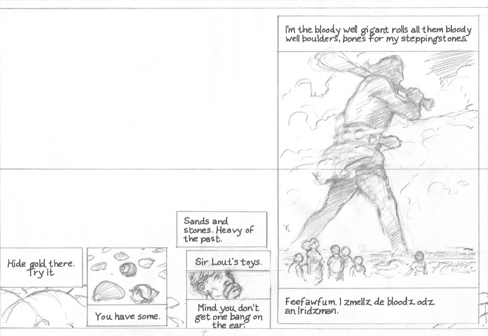
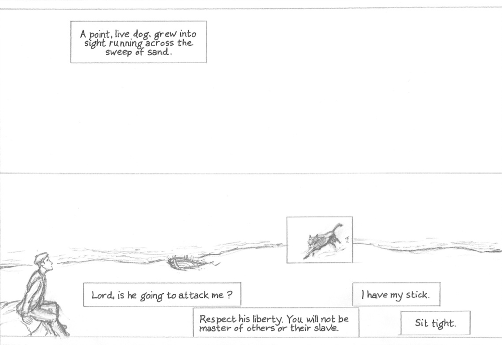
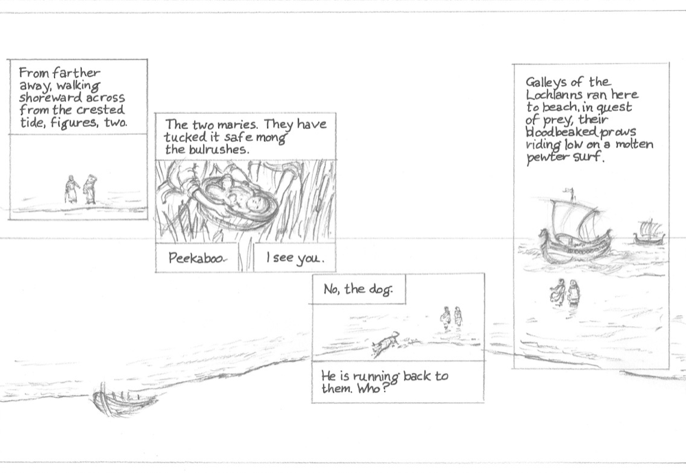
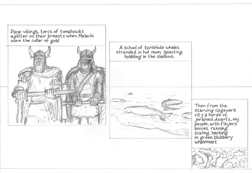
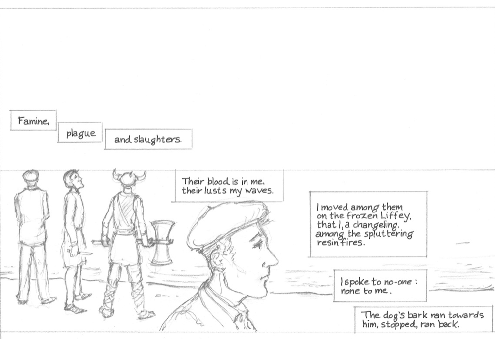
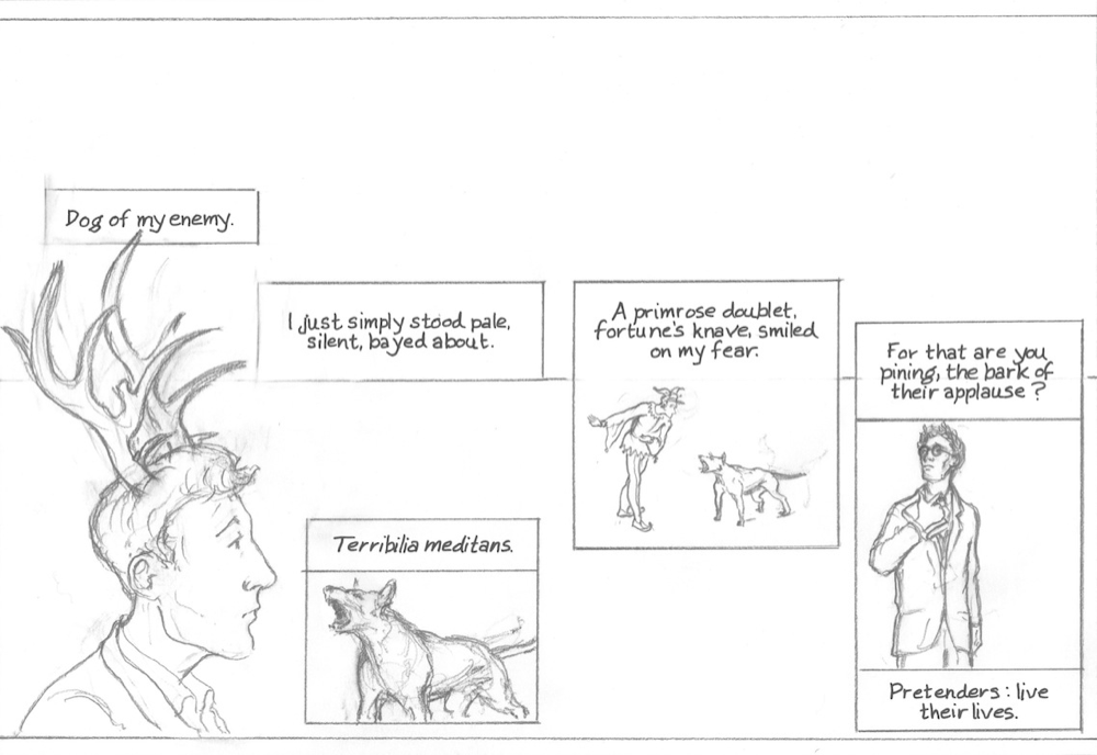
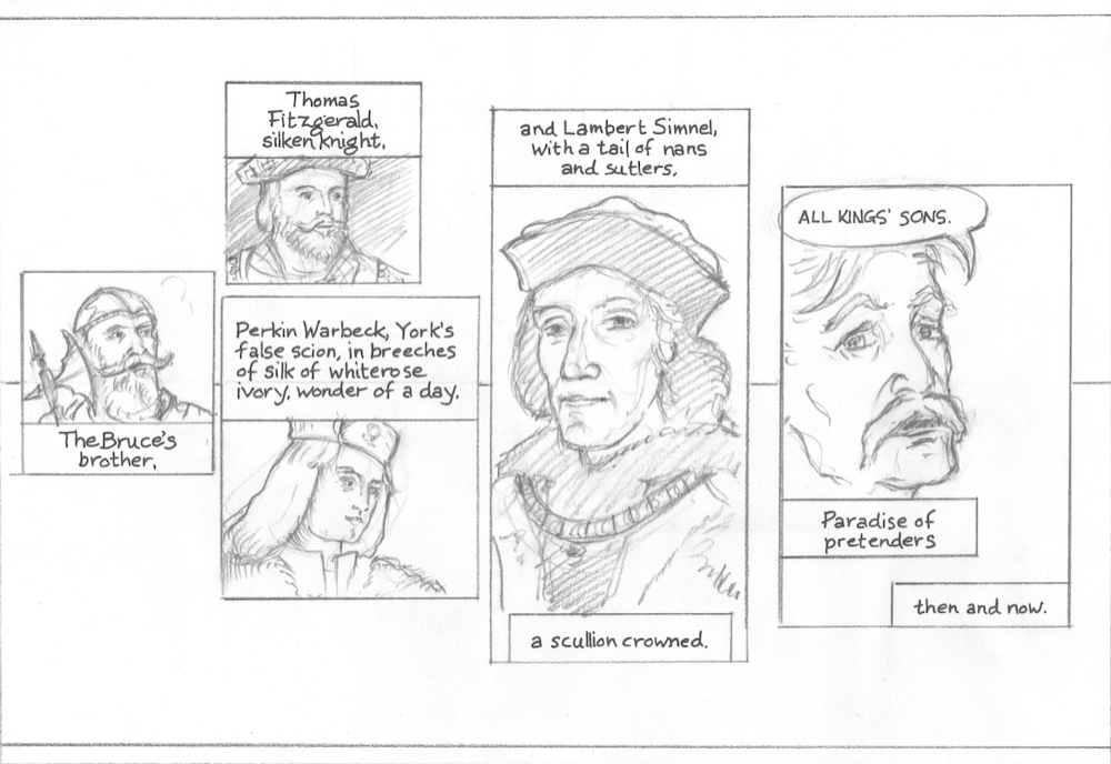
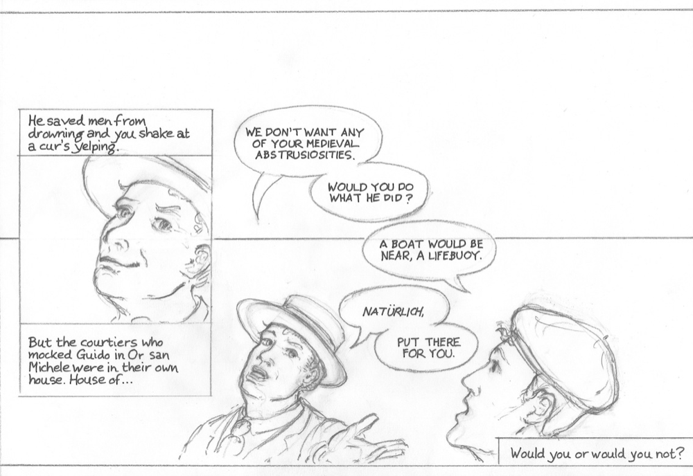
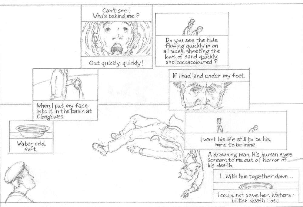
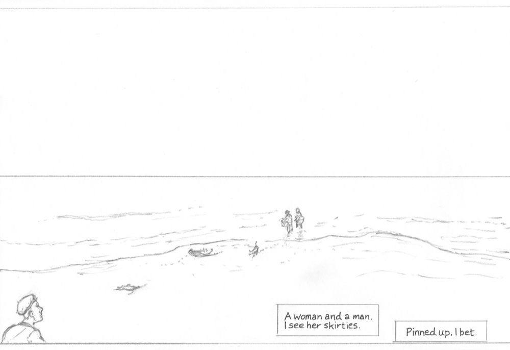
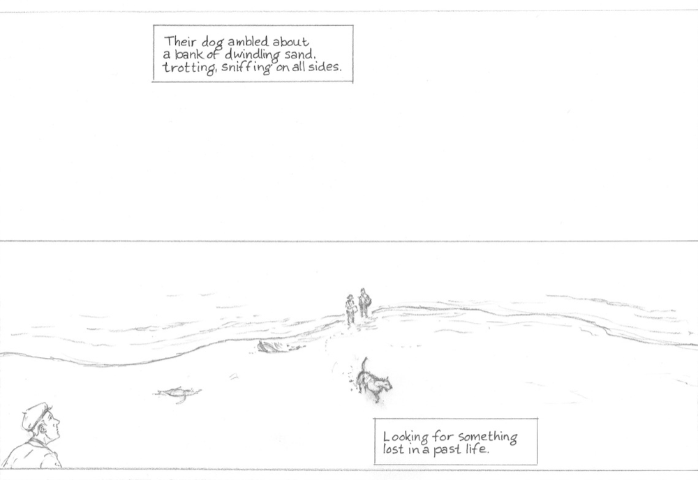
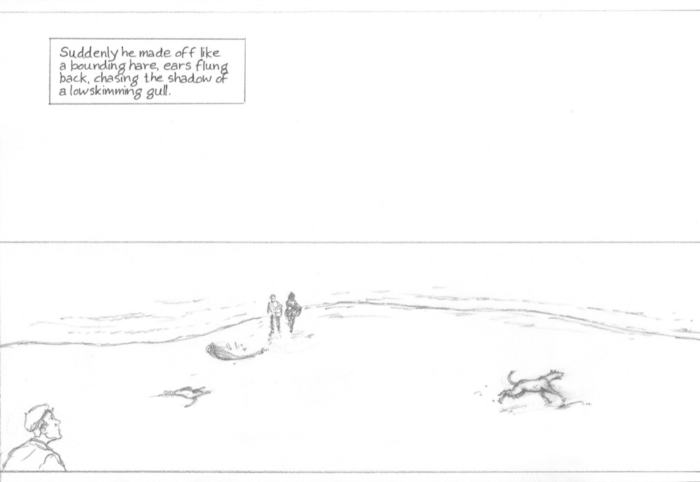
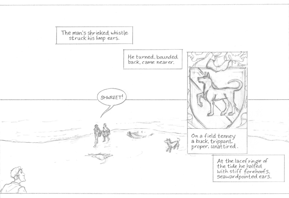
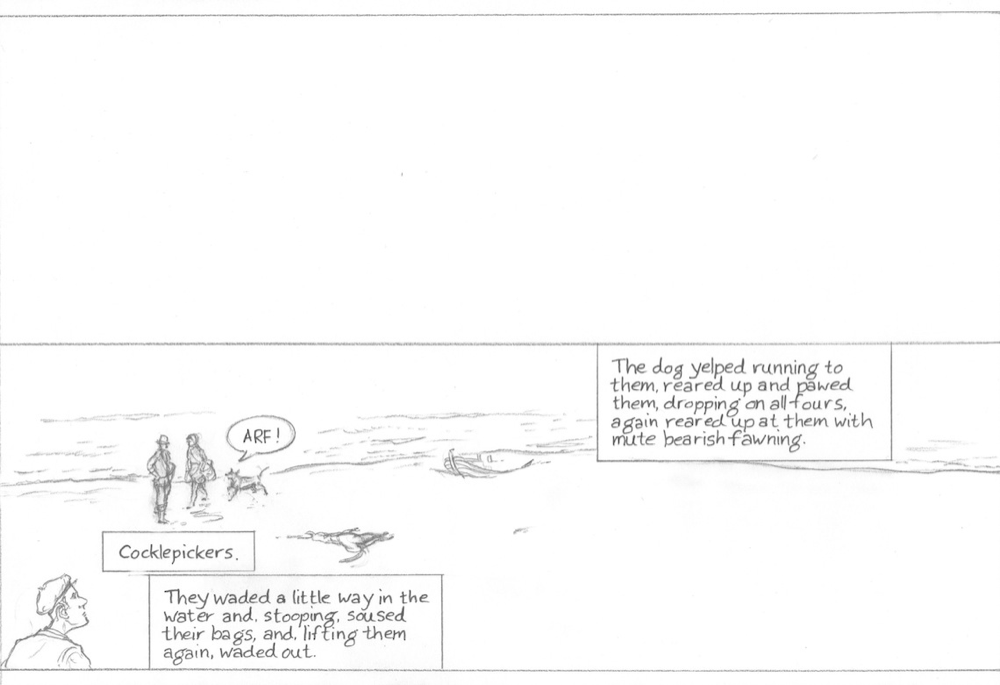
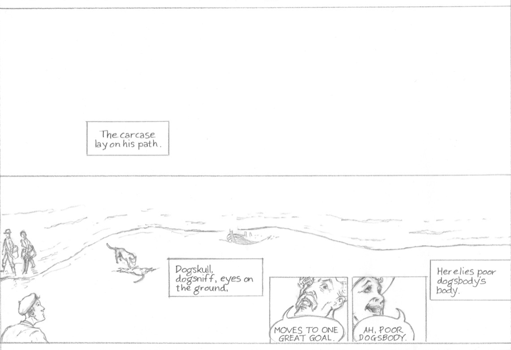
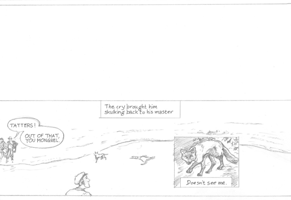
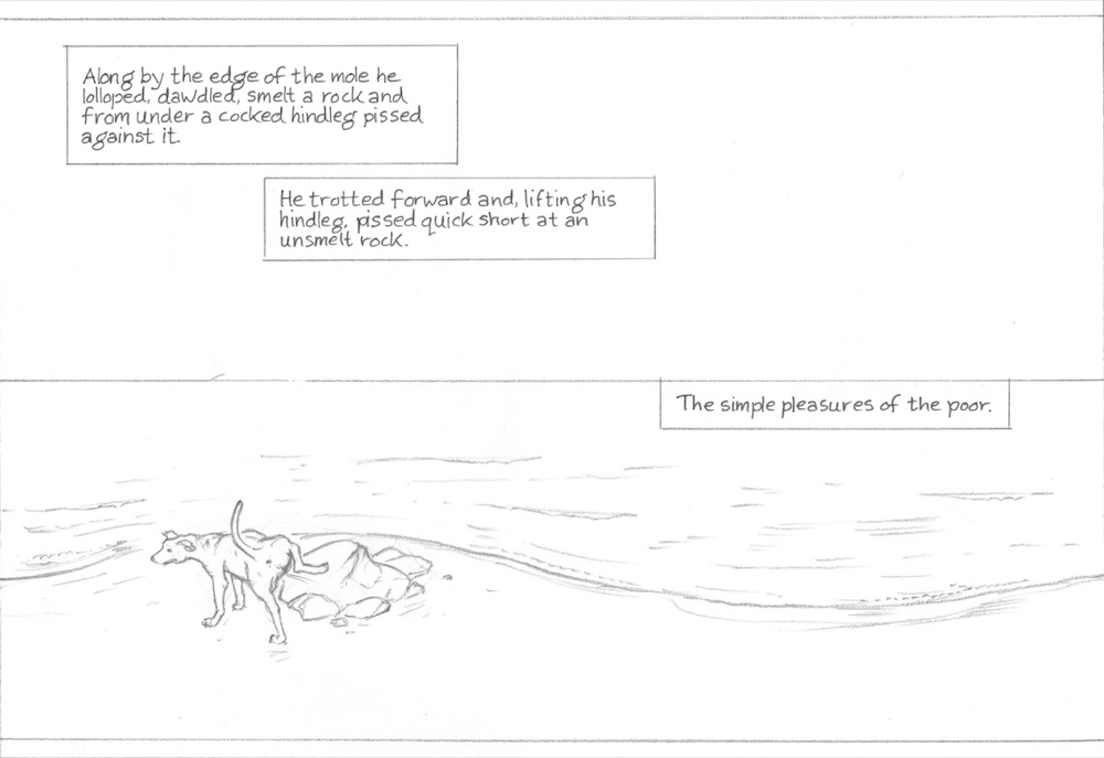
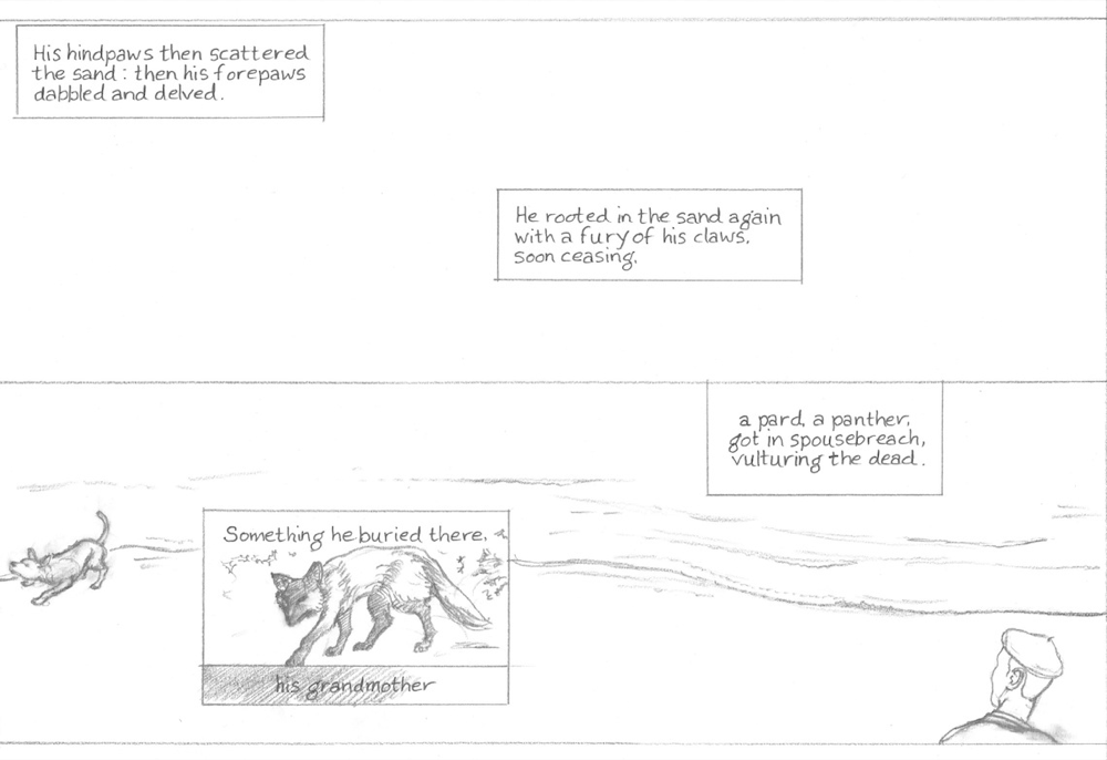
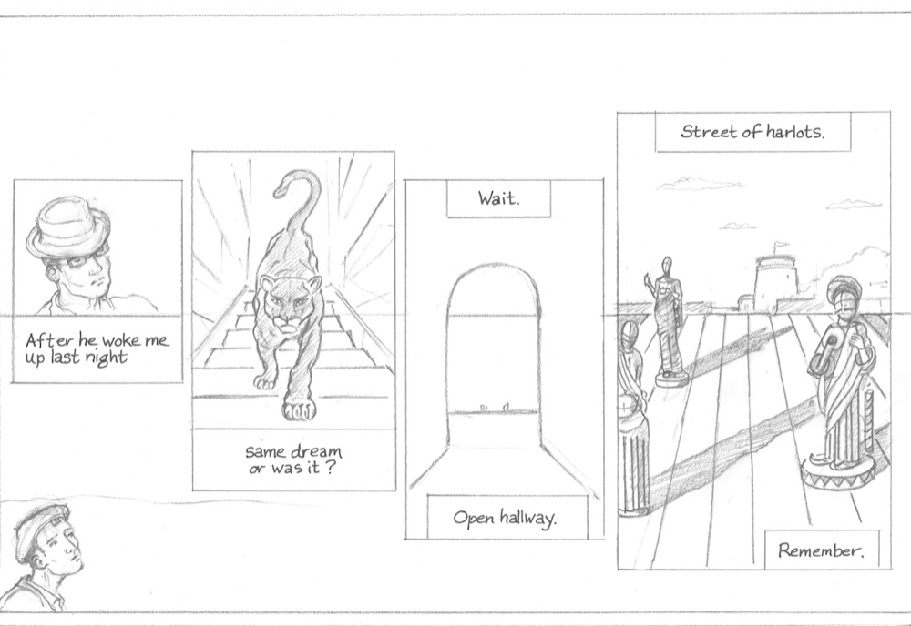
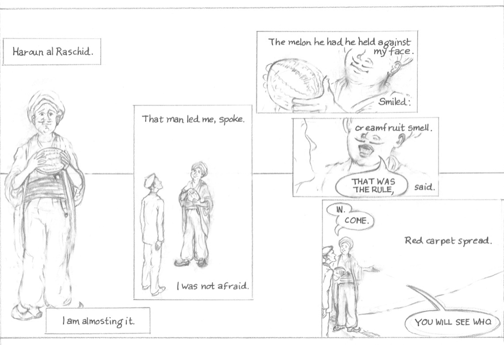
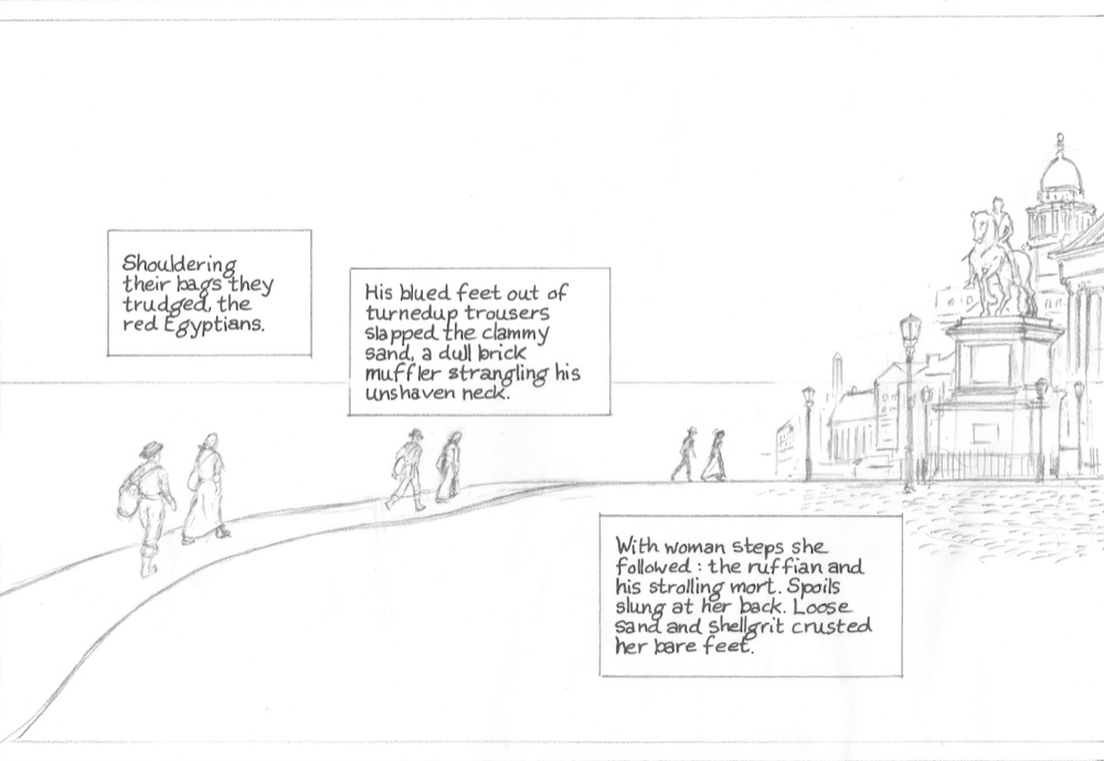
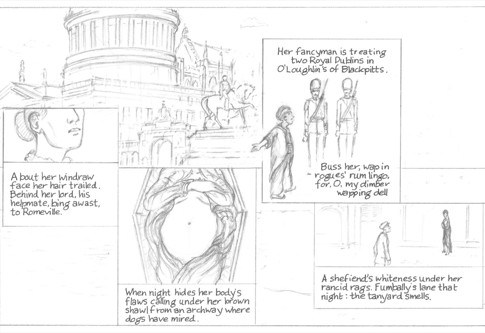
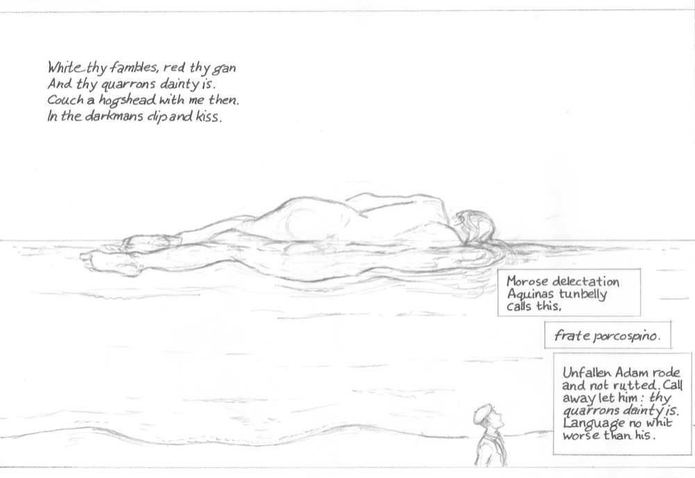
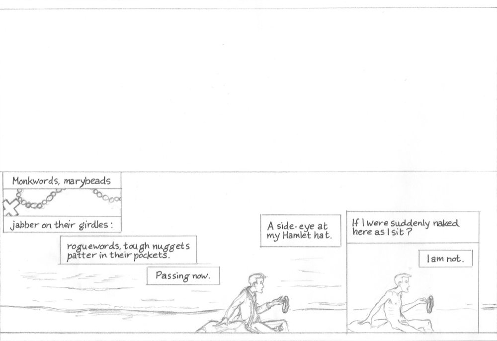
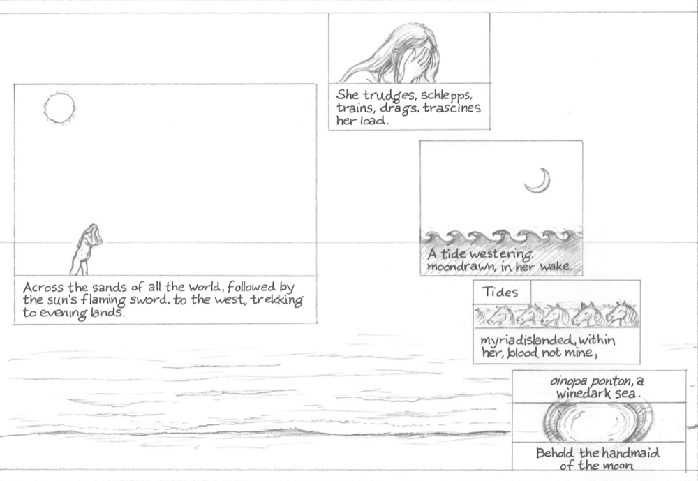
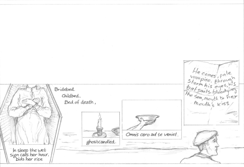
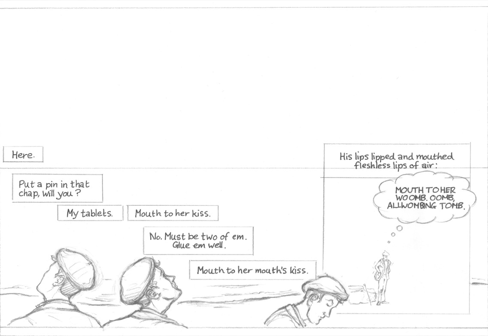
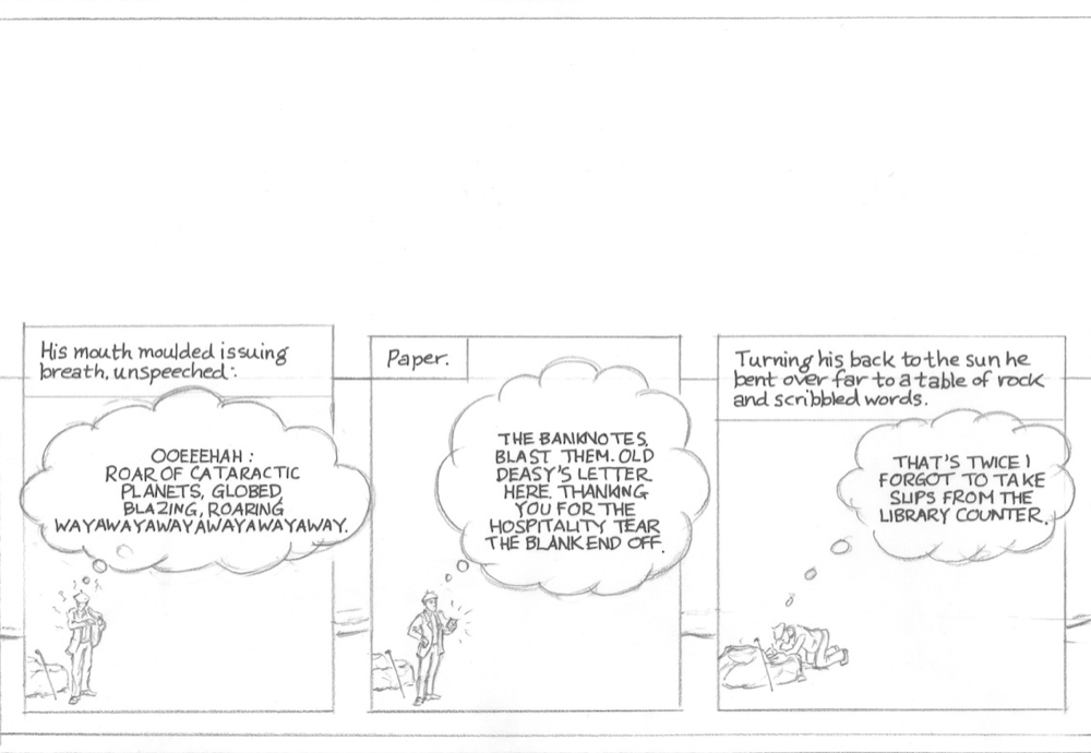
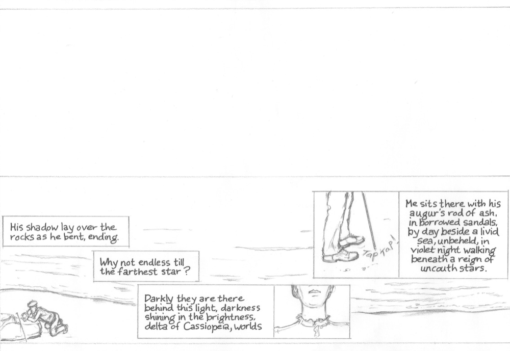
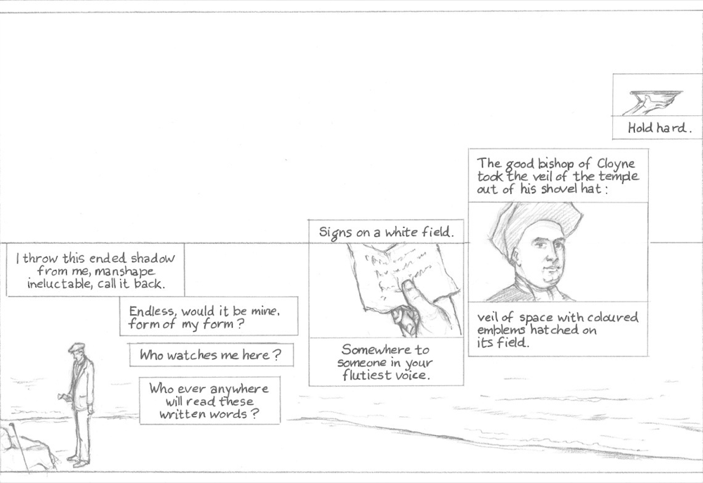
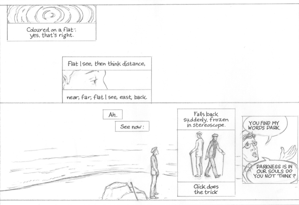
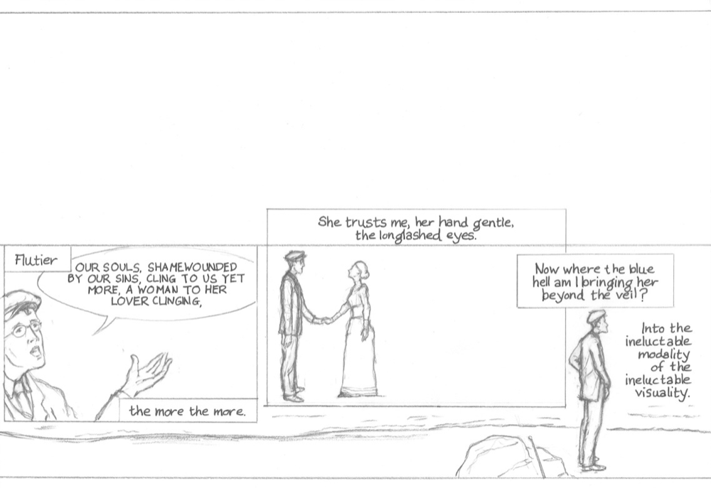
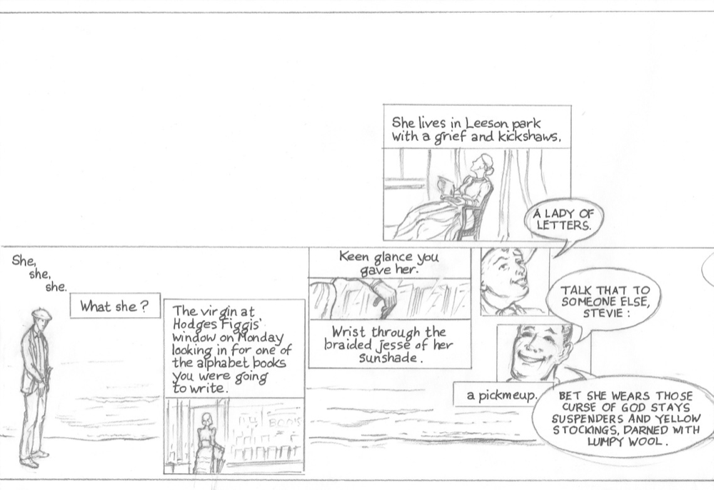
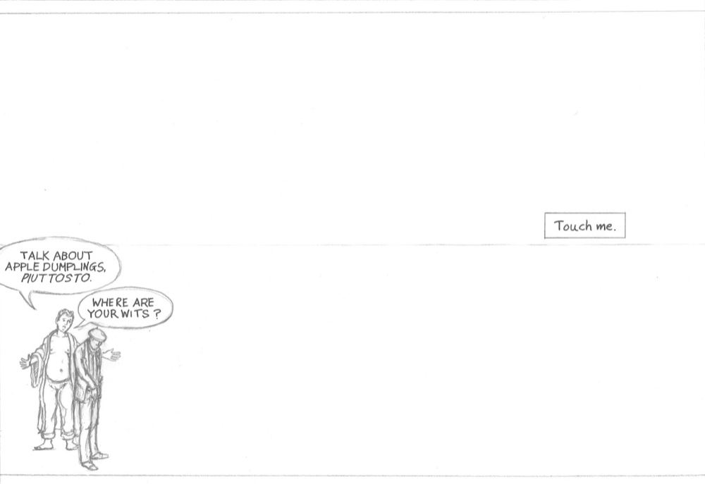
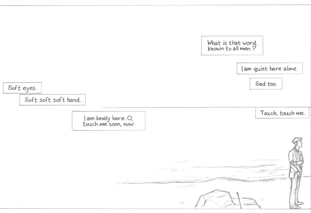
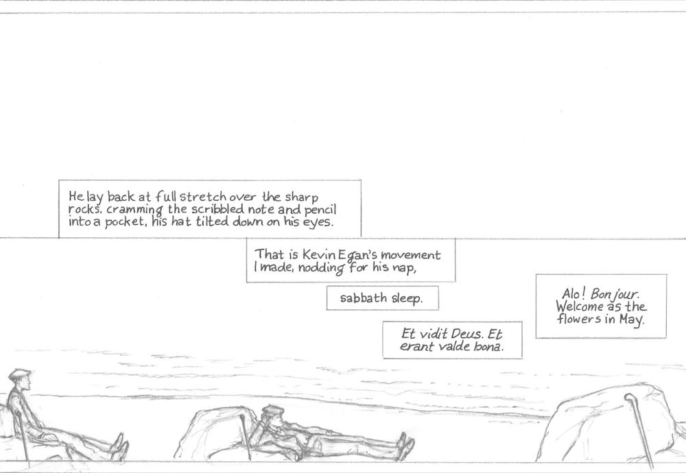
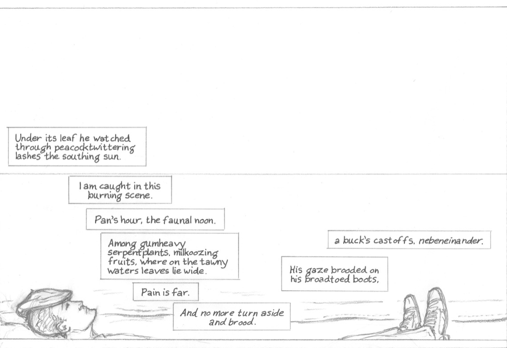
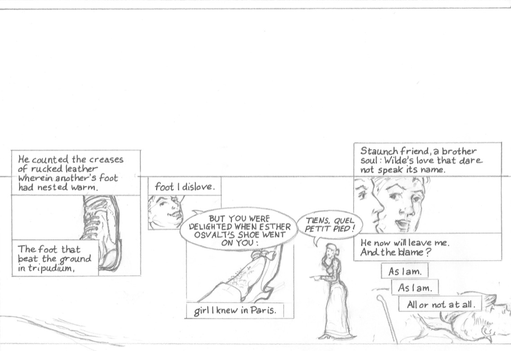
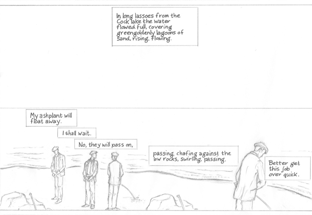
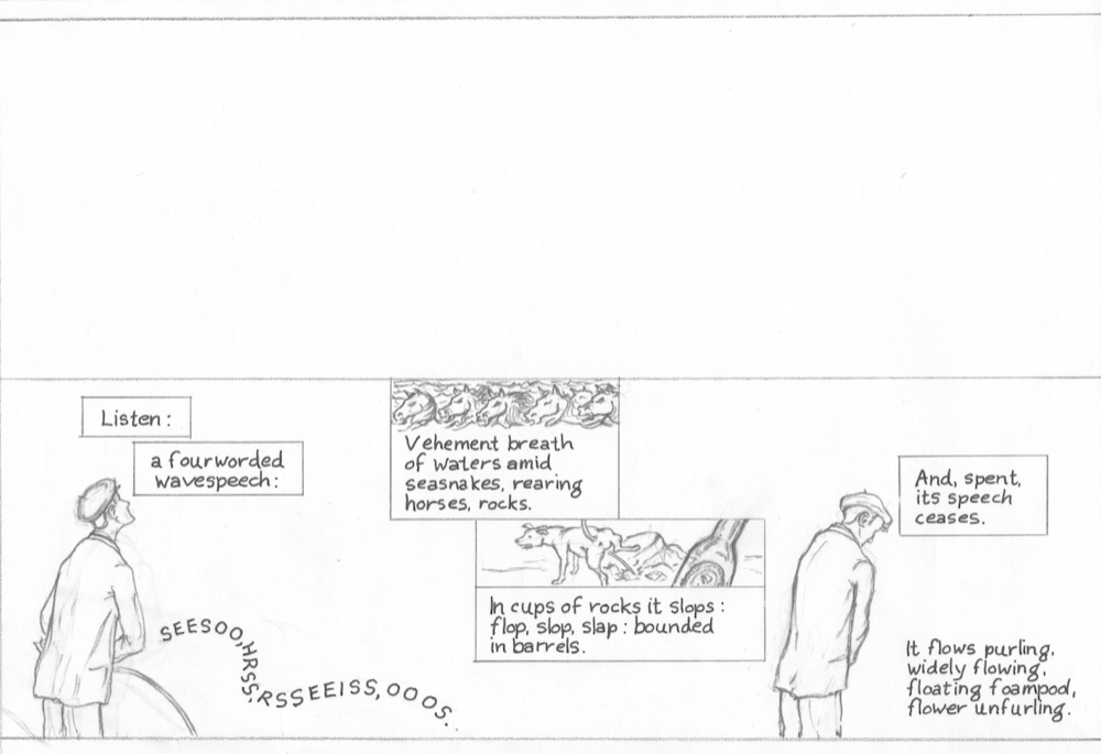
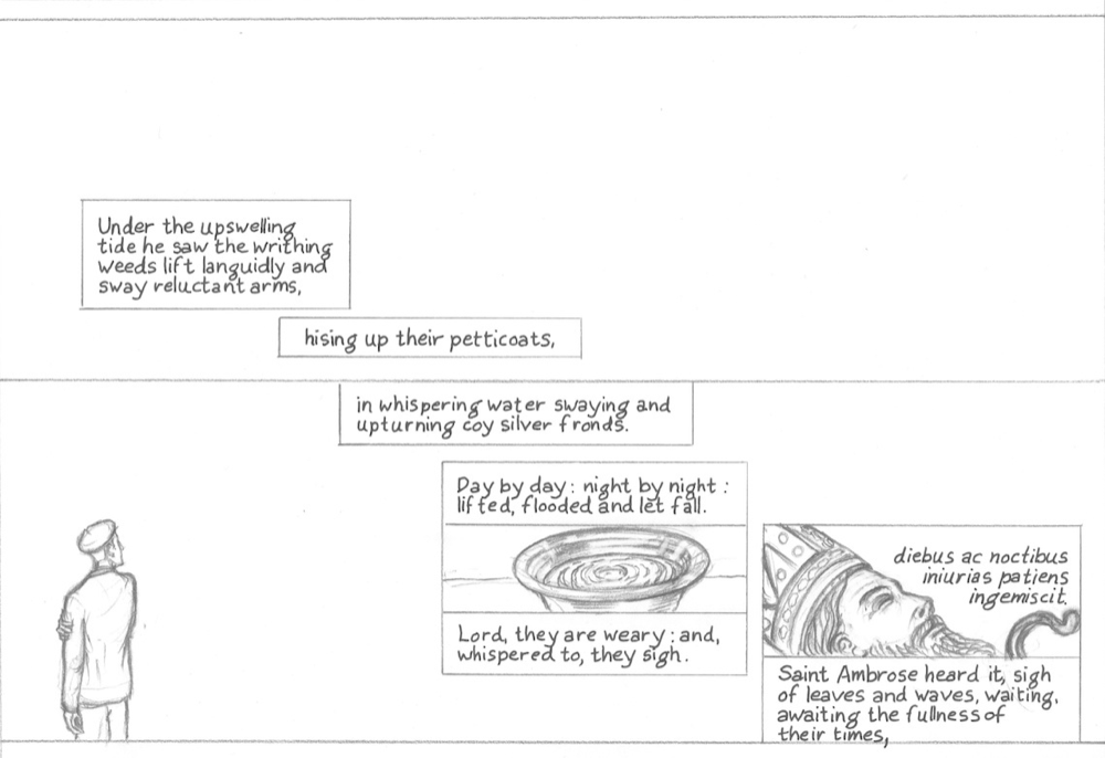
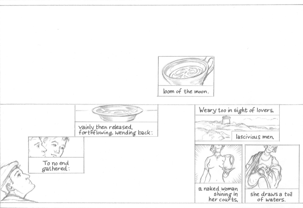
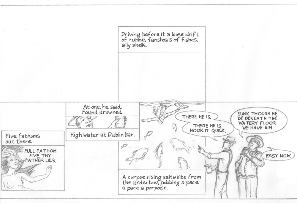
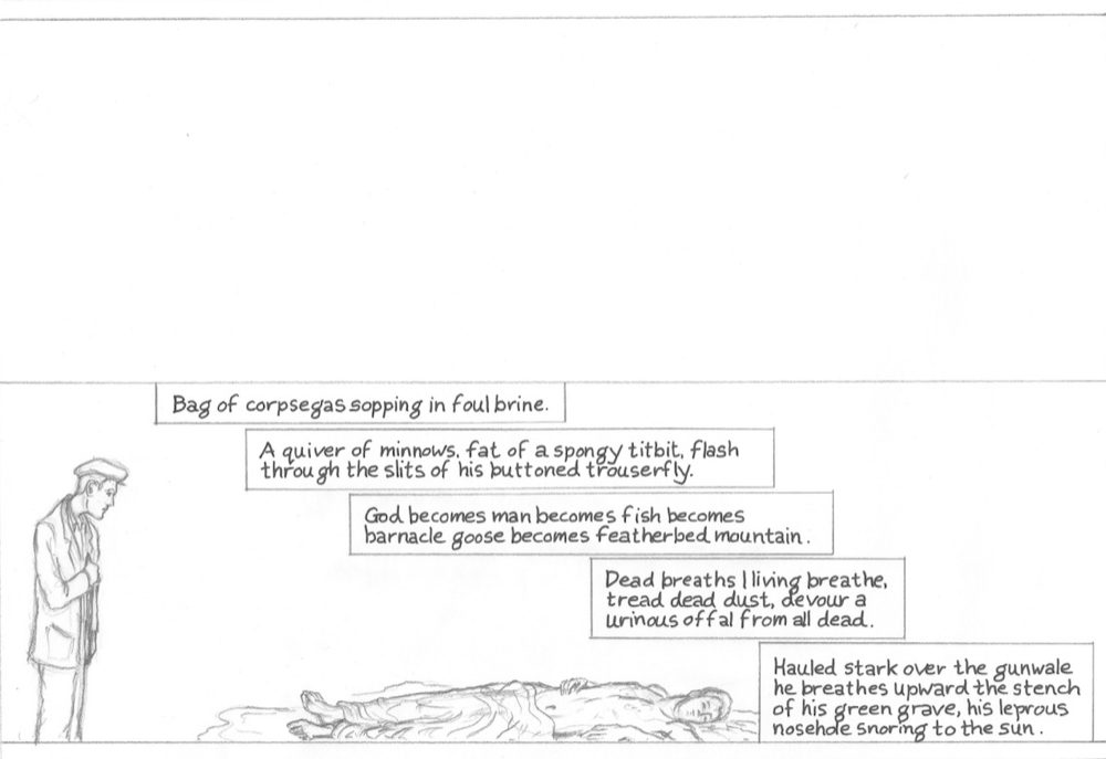
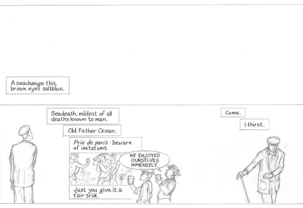
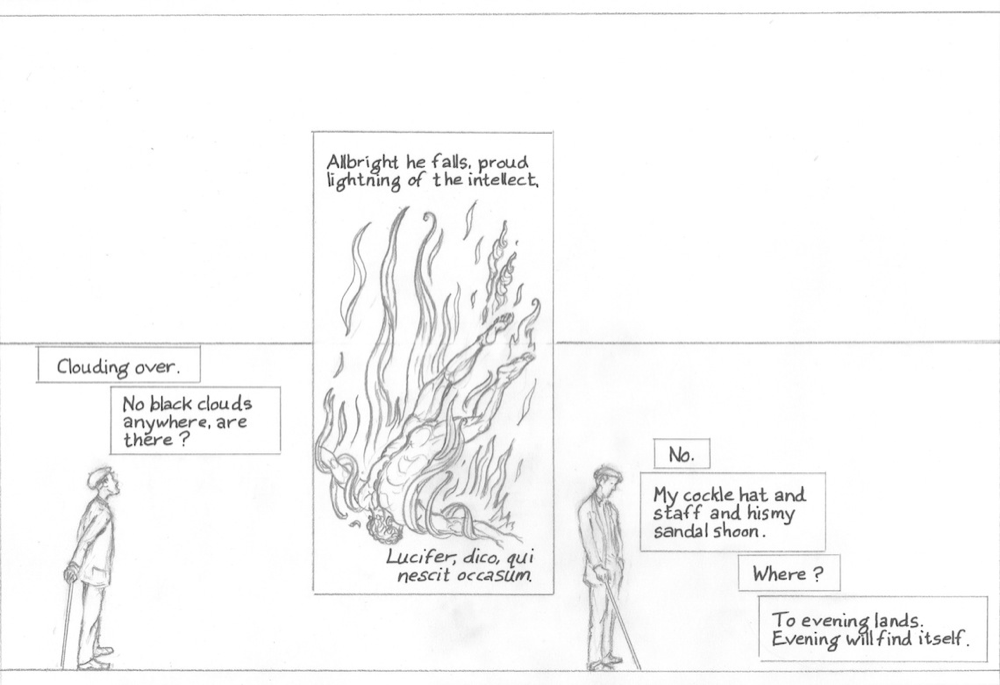
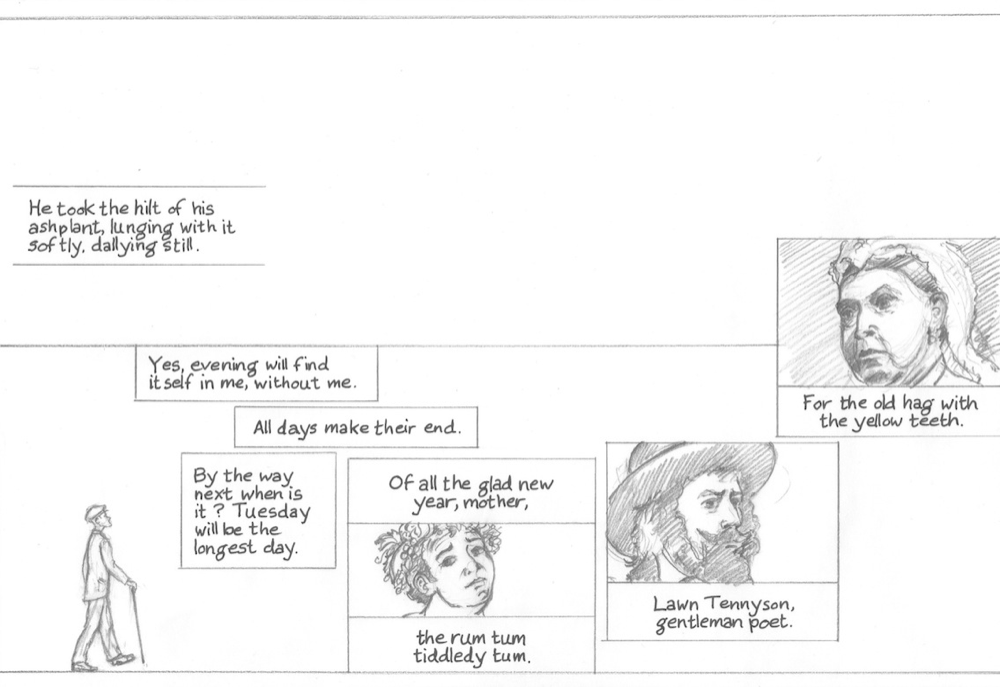
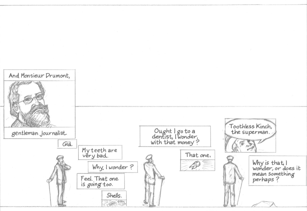
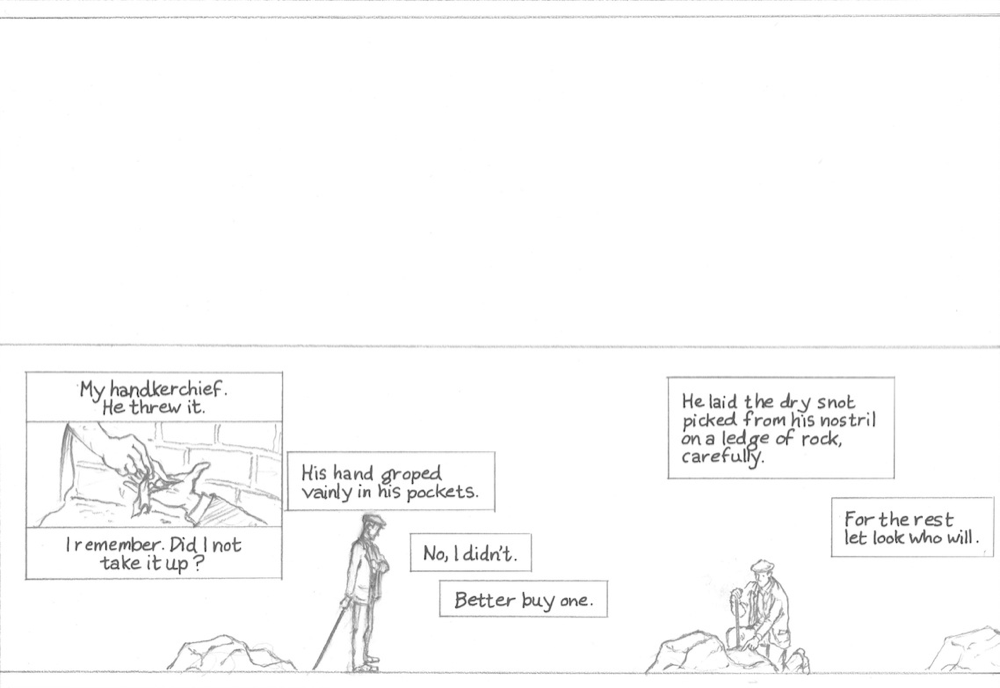
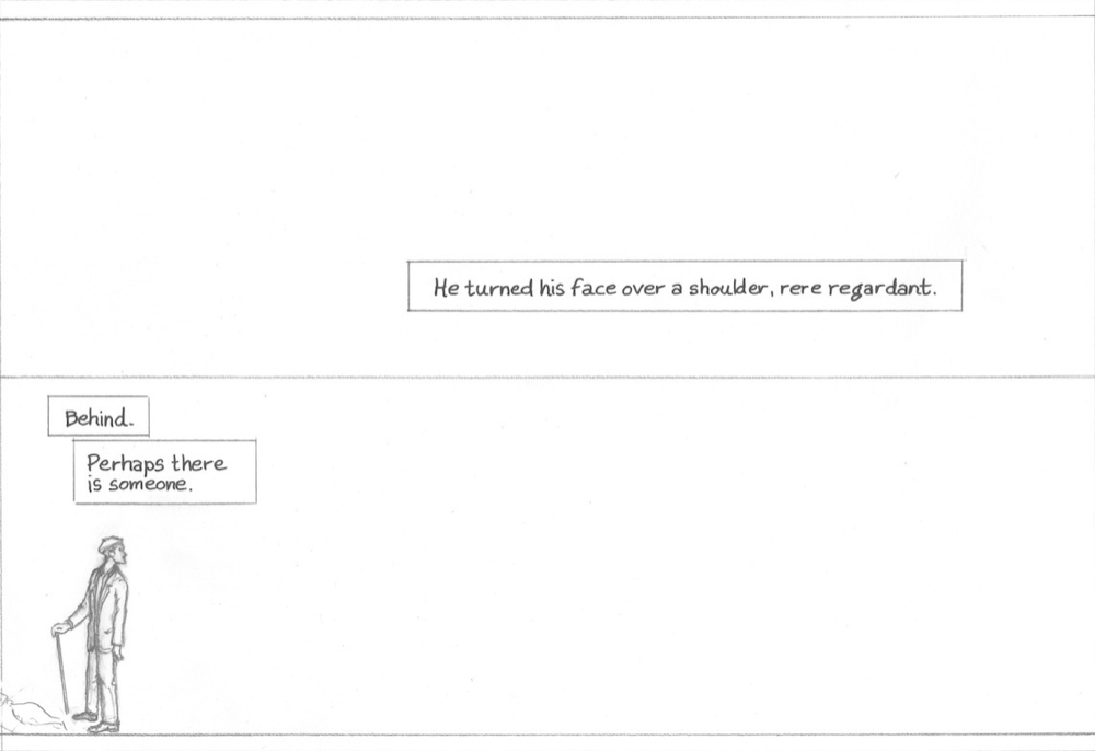
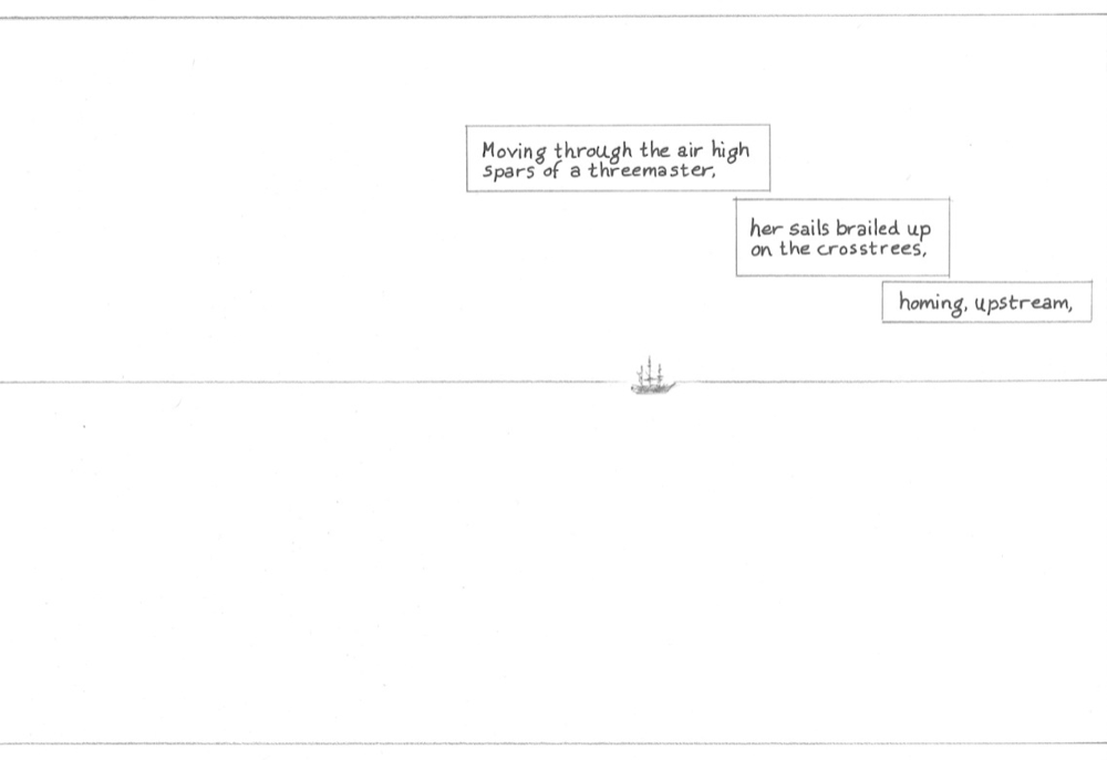
Infinite Ulysses partners with Ulysses "Seen"—a thoughtful, visually rich interpretation of Ulysses via digital comic—to bring Joyce's amazing novel to more readers. Future plans for our collaboration include easy links between passages in the book and panels of the online comic. For this Bloomsday 2015, we're excited to share the drafts of Ulysses' "Proteus" episode (episode 3) in comic form!
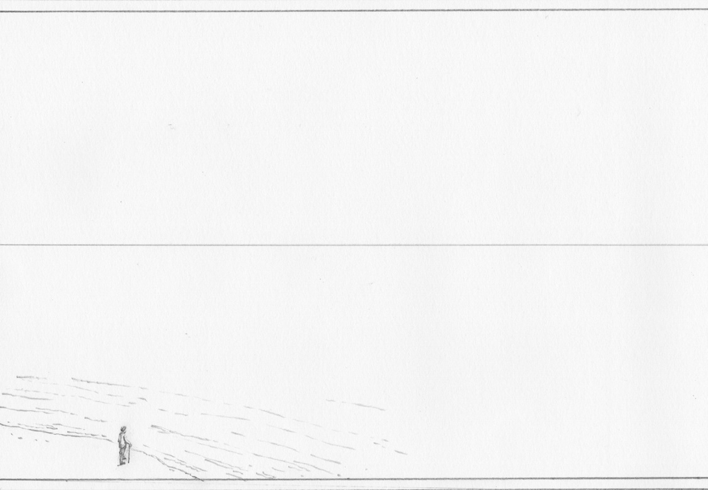
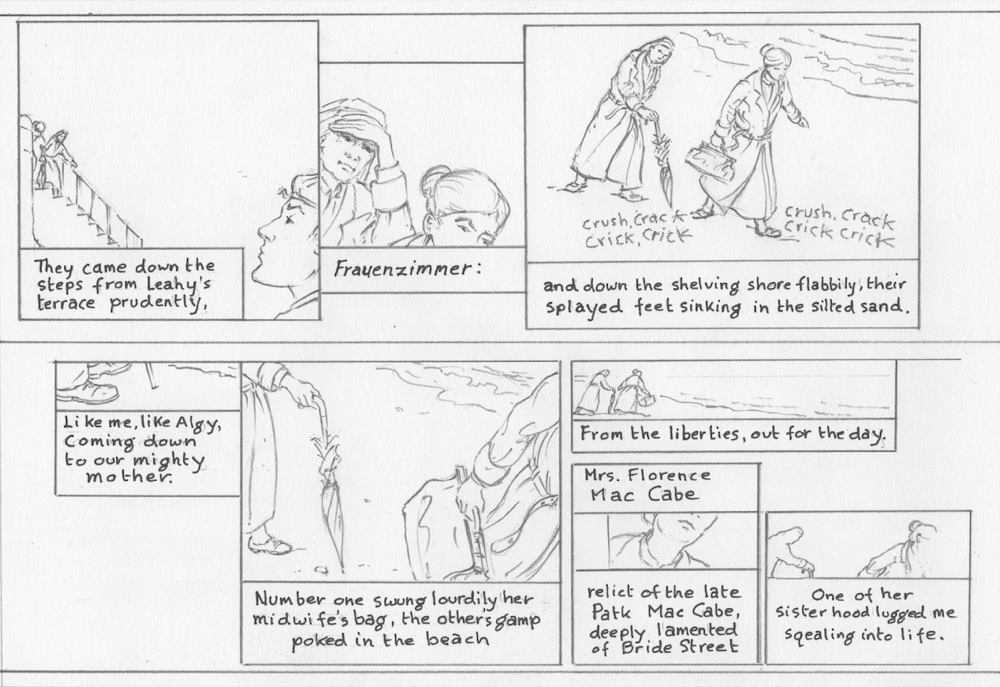
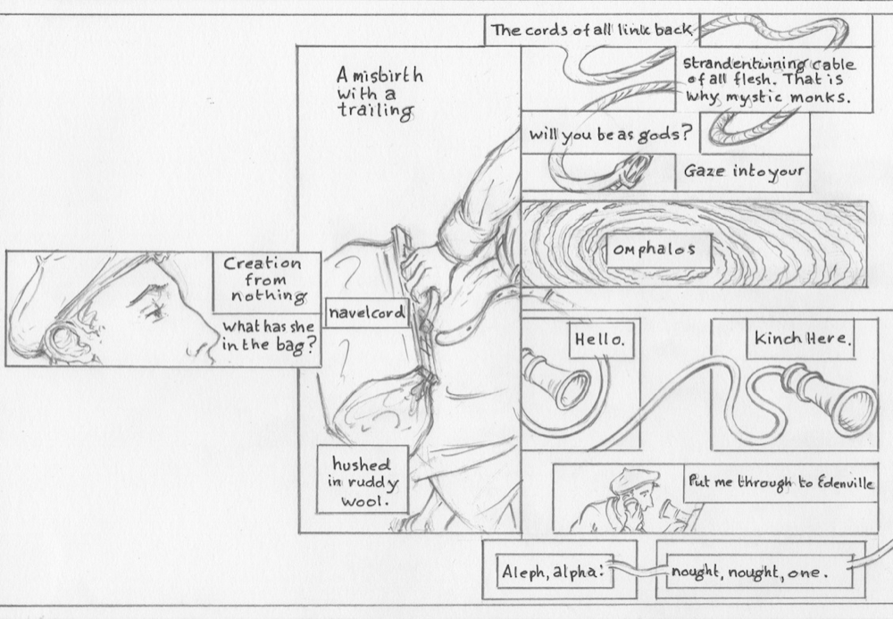
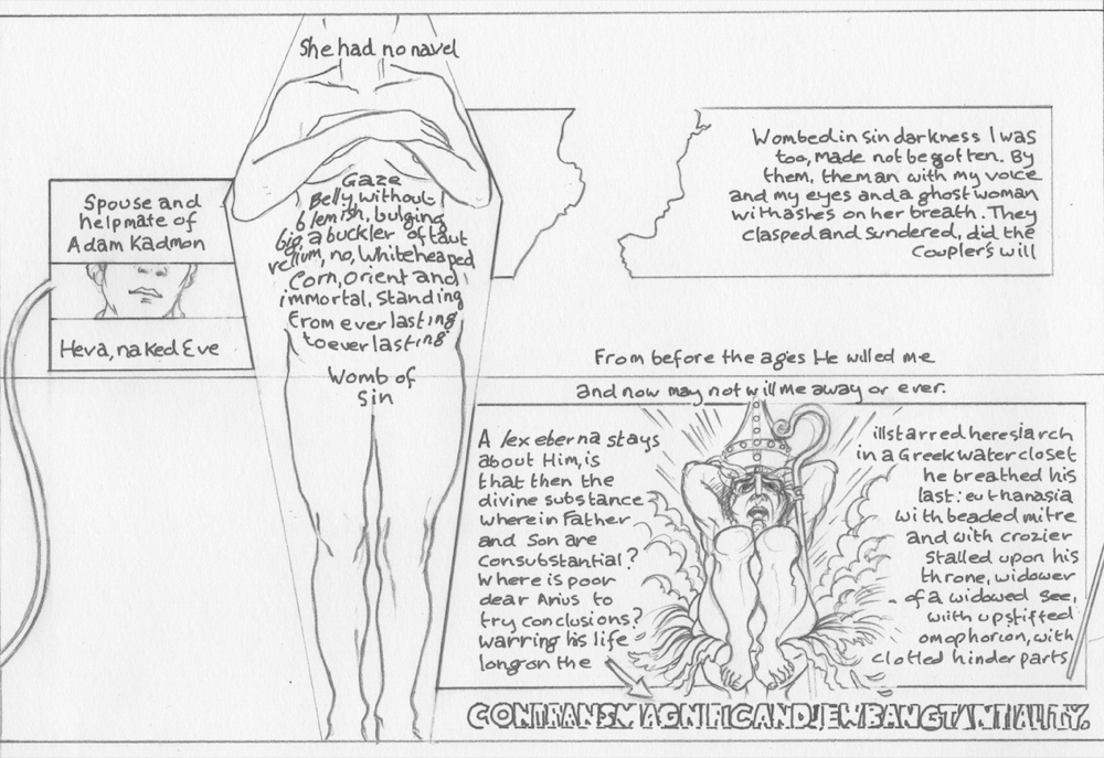
Use the slideshow to move through the draft panels for Ulysses "Seen"'s "Proteus" episode, and read below for more information on the process involved in this exciting work!
Storyboards and initial page design are by Rob Berry, with Clinton Cahill turning these into fair-copy pencil drafts. Amanda Sigler was a consultant for creating a classroom-friendly comic. Inking will be by Berry and Cahill, with colors and scenery painted by Dan Pipito. Amanda Visconti set up the slideshow.
During Bloomsday last year, Joycean artists Robert Berry and Clinton Cahill had the very rare chance to wander through Howth and Glasnevin (and a number of lovely little pubs) with local Dubliners. They had met some years ago at the 2009 International James Joyce Conference in Buffalo, New York, where they both presented their work adapting Joyce to visual media. Cahill was dismantling and reconstructing Finnegans Wake into numerous ways of looking at depiction, while Berry was developing a much more linear approach of using comics and digital presentation for teaching with his Ulysses "Seen" project.
The talks and the walks around Dublin last year led into such artistically fertile territory that they explored working together. As work on the on-going Ulysses "Seen" will eventually involve numerous artists, Berry asked Cahill if he'd like to take on the challenge of drawing the novel's "Proteus" section. What we're happy to be showing you here is a preview of that full chapter.
The storyboards and initial page design for "Proteus" were done by Berry in 2012 and, like most storyboards a cartoonist makes for himself, was quite loose in depiction and more about the arrangement of the text and selection of accompanying images. Rather than "tighten up" any of those initial drawings, he sent the batch off to Cahill with only a handful of notes identifying characters or images being referenced in the hopes that this would build a more collaborative element to depicting the chapter.
At this stage, Joyce scholar Amanda Sigler was brought in. Ulysses "Seen" is a teaching platform after all, and the goal was to present each of these drawings with an accompanying "Readers' Guide" entry. Sigler's own background on Joyce and modernism makes her a perfect choice for writing about this chapter and Stephen's youthful musings about art, family, sex and Paris. By bringing Sigler into the conversation early, well in advance of the finished drawings, Cahill and Berry had a greater opportunity to engage their adaptation with the way Joyce is (or might be) taught in a classroom.
We're hoping to offer that same opportunity for dialogue again here at Infinite Ulysses and share with you the fair copy of Cahill's pencils for the "Proteus" episode. This is not the final version of the work, of course. The drawings will still be inked by Cahill and Rob, with colors and scenery painted by Dan Pipito. The pencil drawings here, though, clearly represent their adaptation of this very difficult chapter into the visual language of comics, and we'd all like to hear your opinions on the work thus far.
A few quick notes on this presentation:
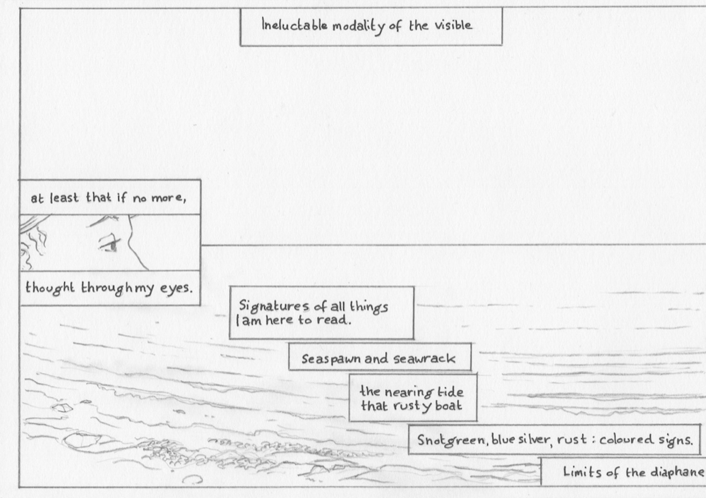
- Berry's usual efforts have been made in this adaptation to indicate spoken words, ambient sounds, inner monologue and narrative voice within the novel through word balloons and colored narration boxes. These pencil drawings have no such color yet, making it difficult to separate Stephen from the narrator. We'll save those arguments for the next round.
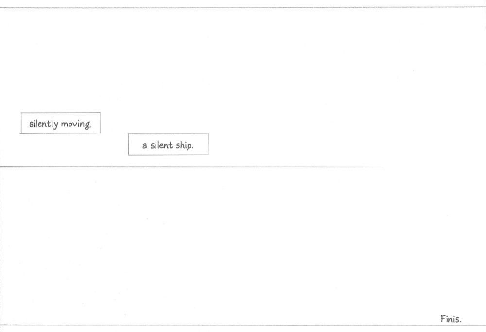
- This chapter begins in the same regular page-by-page format of the preceding chapters of Ulysses "Seen". However, on page eight, once Stephen opens his eyes, the remainder of the chapter will be presented in a continuous scroll of over one hundred pages imitating the "stream of consciousness" method that the chapter was (in)famous for. Each page in this earlier version is still divided to allow for easier loading and to better establish the breaks for Sigler's "Readers' Guide". We believe you'll still be able to get the flow of one page into the next in this slideshow format, but the intention for reading and design is a continuous scroll of one long image.
- You'll also notice a constant horizontal line dividing the pages. In the scroll format, this is intended to be the fixed horizon between sea and sky and will contain one long panorama of Sandymount that serves as the background for all of Stephen's musings. Since that will be painted and added in post-production, the line serves as an indicator for Cahill on where to position the figures and additional panels. You'll need to imagine the horizon and then wonder at why some things are above it and some things are below.
We hope you enjoy this preview, and look very forward to your comments. Rob Berry can be reached @UlyssesSeen, or robberry237 at Gmail. Happy Bloomsday, everyone!
